Google UX Design Professional Certificate Project
CinemaMovie
UX/UI DESIGN PROJECT • Worry-free entertaining experience
CinemaMovie • Worry-Free Entertaining Experience
The Problem
Picking the right movie experience can be a problem for a busy professional and movie lover. First, he’s busy researching a movie that fits his tastes and needs advice. Then has no time to wait in line to get the tickets and needs an online reliable online ordering ticket website.
The Product
CinemaMovie is a modern movie theatre that offers movie premiers and the latest movies. The typical user is between 2-60 age, with most moviegoers between 18-24 and 25-39 as the biggest age group. CinemaMovie’s goal is to make an enjoyable experience through a stress-free booking experience.
The Goal
Design an intuitive CinemaMovie website to help quickly find and book tickets for the perfect movie participation for each client’s preference, paired with a qualified review and a stress-free movie experience.
Responsibilities:
I was conducting interviews, paper and digital wireframing, low and high-fidelity prototyping, usability studies, accounting for accessibility, iterating on the design and responsive design.
My Role:
UX designer leading the CinemaMovie responsive website design
Software:
Adobe XD, Adobe Illustrator, Adobe Photoshop, Miro
Duration:
Jun. to Aug. 2022
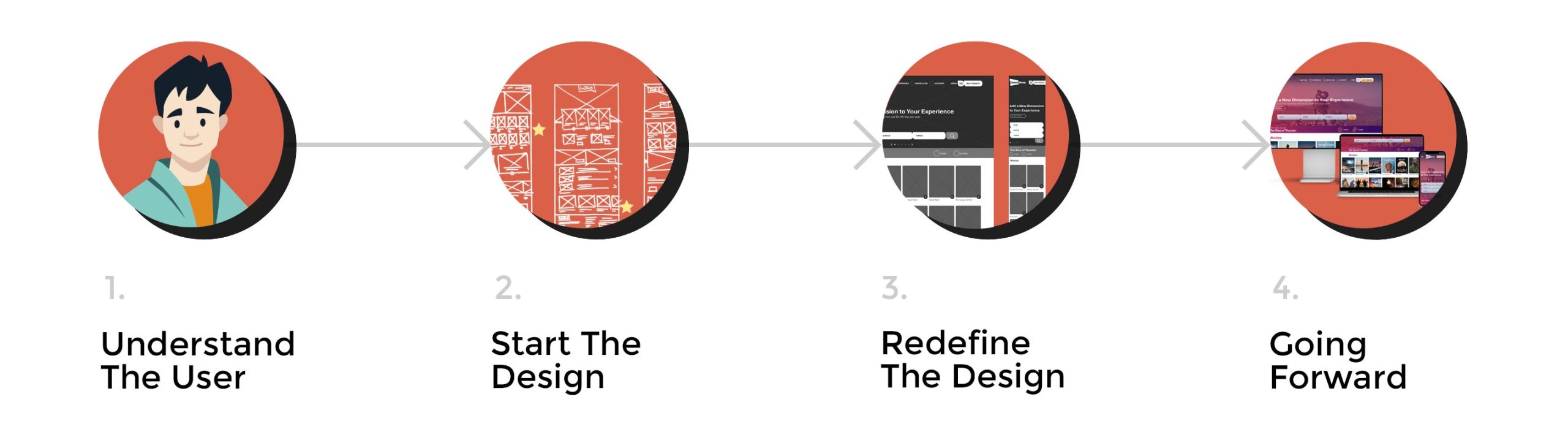
1. Understand The User
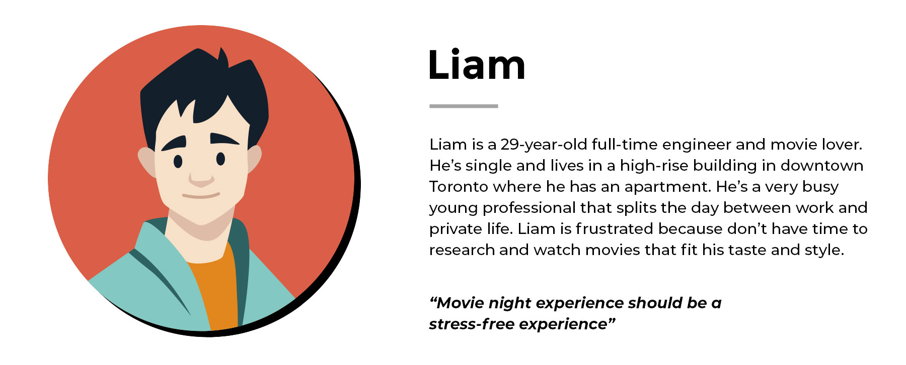
1A. User Research – Persona & Pain Points
1A / 1B / 1C
In building a responsive website for CinemaMovie, I started by laying a solid foundation through the User Research first step, understanding the users and their pain points. I conducted user interviews and used the information I gathered in empathy maps to understand the target users and their needs.
For example, I understood that many movie lovers have busy life that limits their ability to be informed about the latest movie releases and trends.
However, there are movie theatres to see a movie. Still, few places can make a proper recommendation and offer a movie experience to fit a taste, which confuses and frustrates the users—saying that an enjoyable time can usually become a challenging situation and defeat the purpose of having a pleasant experience.
PAIN POINTS:
1. INFORM: Movie theatre websites often miss presenting and analyzing the movies they offer, just playing them. Therefore, movie lovers must research and find specialized websites for movie reviews.
2. EXPERIENCE: A complicated process that presents and informs the users can discourage and determine users to drop off. Some elements are not intuitive and tend to take unnecessary steps.
3. BOOK: Some websites that offer an online movie booking experience require the user to be signed in from the beginning. Many users like to use their personal information just when they want to complete a purchase.
1B. Ideation Process – Problem Statement, How Might We & Crazy Eights
1A / 1B / 1C
The problem statement is that Liam is a busy professional. He needs an intuitive website to help him easily find and book movie tickets because he wants to enjoy a stress-free movie night experience with his girlfriend.
With the user’s pain points and problem statement, I started the How Might We exercise to brainstorm ideas to solve Liam’s issues.
1. Amp up the good – I know that there are many options to see a movie, so we thoughts that making the movie theatre could be the best. Based on that, I came up with the following questions:
How might we make seeing a movie an experience that is fun, informed and rewarding?
2. Change the status quo – The research revealed that Liam could find many places to see a movie, but to find the right movie type, to see a movie premiere and to get specialized advice.
How might I redesign something that helps Liam find and book the right movie?
How might we bring movies to Liam or suggest movies in a particular way to present and access?
3. Break the point-of-view into pieces – Based on the pain point that Liam’s not aware of what movies will fit his tastes, and he doesn’t know how to choose a movie, I come up with the following questions:
How might we improve the UI and appear a cleaner, more informed website? Could I create an area to show specialized movie reviews? What about creating different movie filters to select movies based on specific filters?
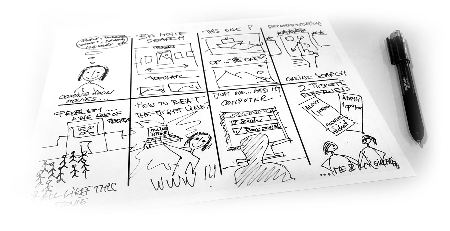
After this, I draw the Crazy Eight exercise with Liam’s issues and How Might We questions in mind.
I learned from the Ideation Process that it is vital to articulate the real user needs and address them adequately, prioritizing from the most important to the least and using them as a base for the future solutions I want to implement.
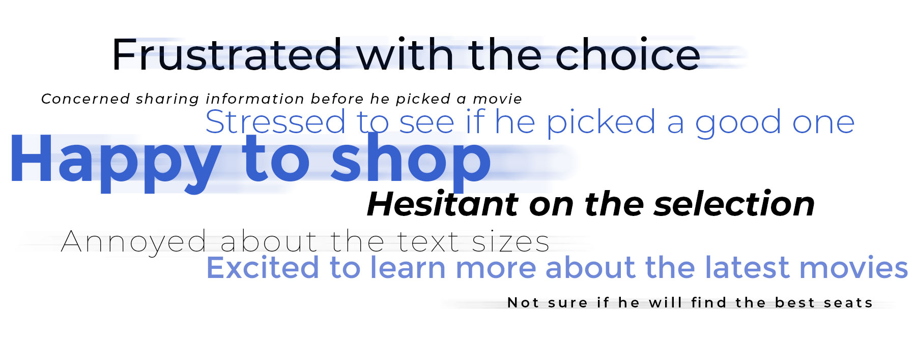
1C. User Journey Map
1A / 1B / 1C
With the user’s pain points, problem statement, and How Might We and Crazy Eight steps completed, I started the How Might We exercise to brainstorm ideas to solve Liam’s issues.
Next, I created a user journey map of Liam’s experience using the site to help identify possible pain points and improvement opportunities. I found that the user is “Excited to learn more about the latest movies” and give in the opportunity to receive details to create excitement. On the other hand, the user is “stressed to see if he picked a good one,” making the user hesitant and frustrated. To avoid the found pain-points, I decided to define an area where to read clear authorized reviews, make buying tickets as simple as possible, and provide the check-in just after the user picked a movie, not before.
2. Start The Design
2A. Sitemap
2A / 2B / 2C / 2D / 2E
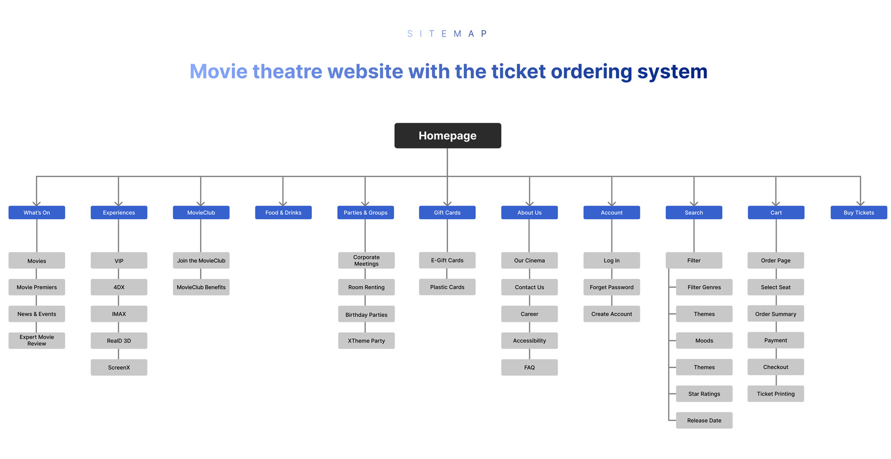
The next phase in the process is to start the design. Navigation was one of the main pain points revealed in previous studies. My goal was to improve the information architecture by creating straightforward navigation and a structure that would be easily accessible and intuitive.
I was aware that people click about three times until they stop and look elsewhere, so I wanted to keep each search at two clicks distance. So I split the navigation into four visible links and a Buy Tickets, and a burger menu with the other links. A drop-down reveals the additional options with less importance or presents other subpages.
2B. Paper Wireframes
2A / 2B / 2C / 2D / 2E
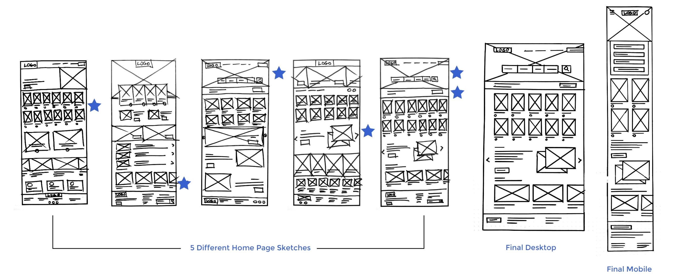
Next, I sketched paper wireframes for each screen of my website, keeping user pain points, navigation and checkout flow in my mind.
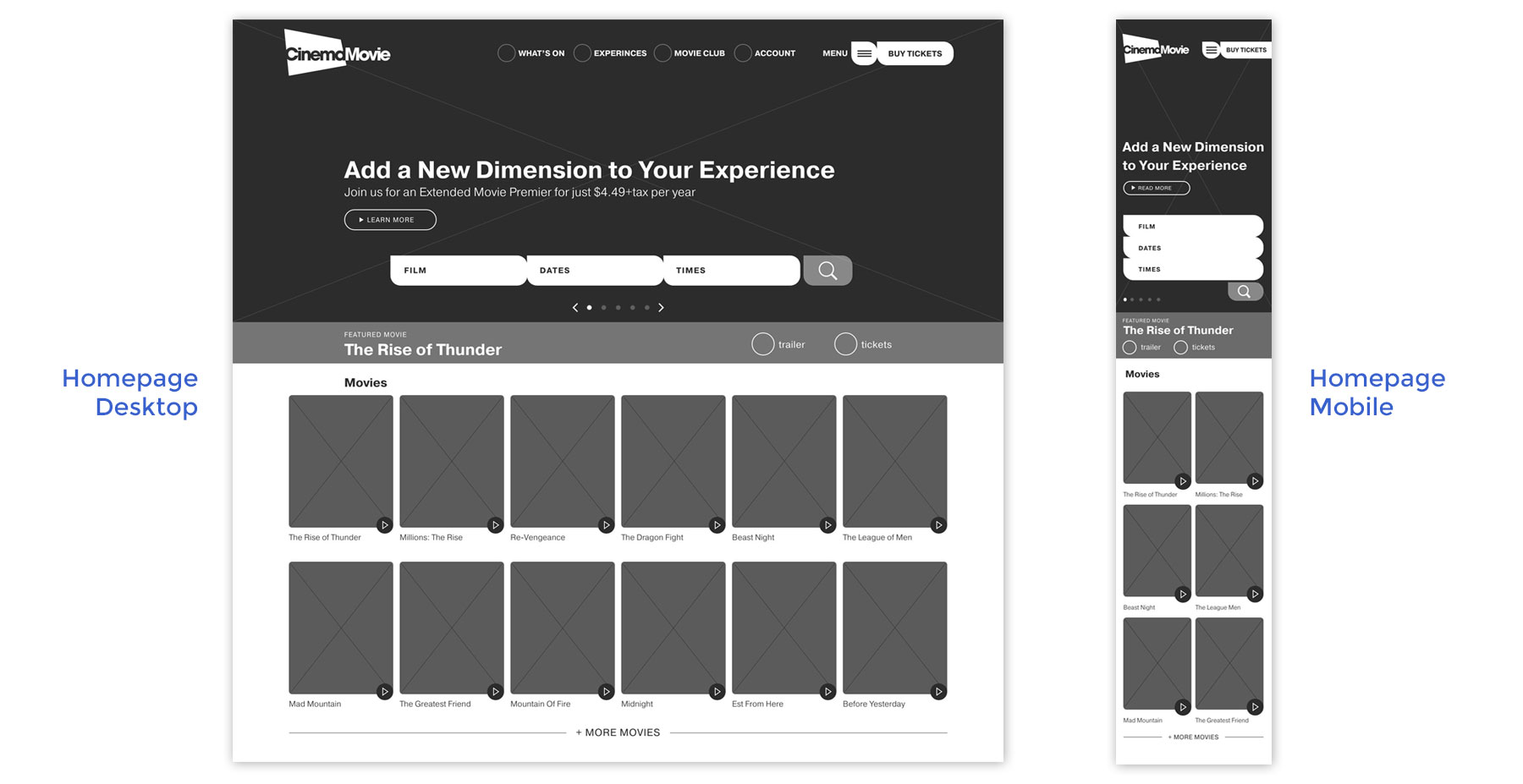
In this exercise, I drew five desktop homepages with different structures. Then, I marked each element that met the requirements with a star using these elements to create a new Home Page composition.
The Home screen paper wireframe focuses on optimizing the browsing experience with users. In addition, because the CinemaMovie website will be displayed on various devices, I started working on designs for additional screen sizes to ensure the site would be fully responsible.
2C. Digital Wireframes
2A / 2B / 2C / 2D / 2E
Moving from paper to digital wireframes made it easy to understand how the redesign could help address user pain points and improve the user experience. For example, prioritizing proper button locations and visual element placement on the home was a part of my strategy.
Because I wanted to use the page’s real estate wisely, I prioritized the information from top to bottom. I used the above fold to show the search options based on preferences and to display the latest movies listed from newest to oldest.
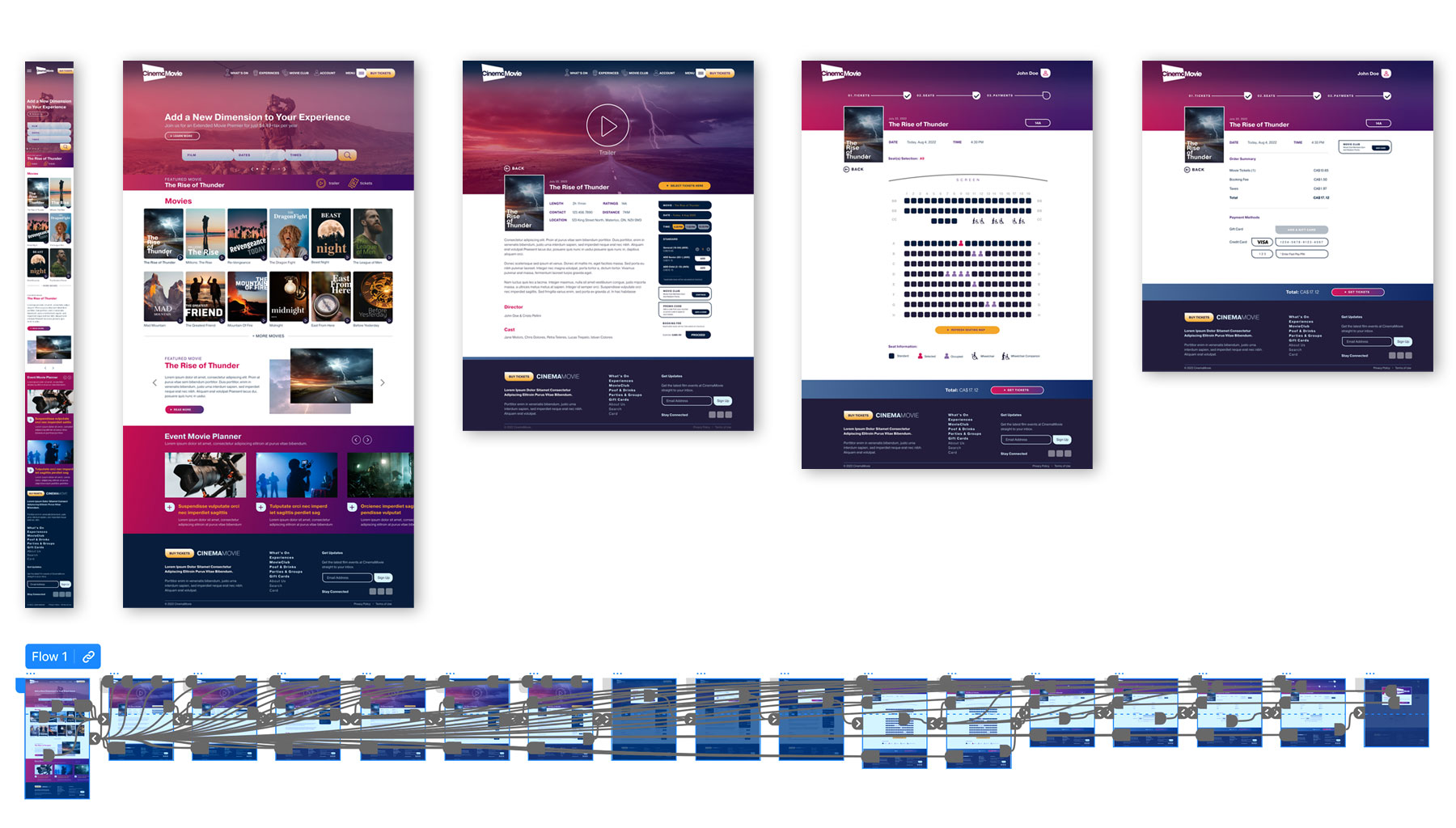
To create a CinemaMovie website prototype, I used Adobe XD. I was impressed with the features and how easy it is to create digital wireframes and low and high-fidelity prototypes.
A big takeaway from this is that I liked Figma, and now I want to add Adobe XD to the list of my favourite programs.
2D. Low-Fidelity Prototype
2A / 2B / 2C / 2D / 2E
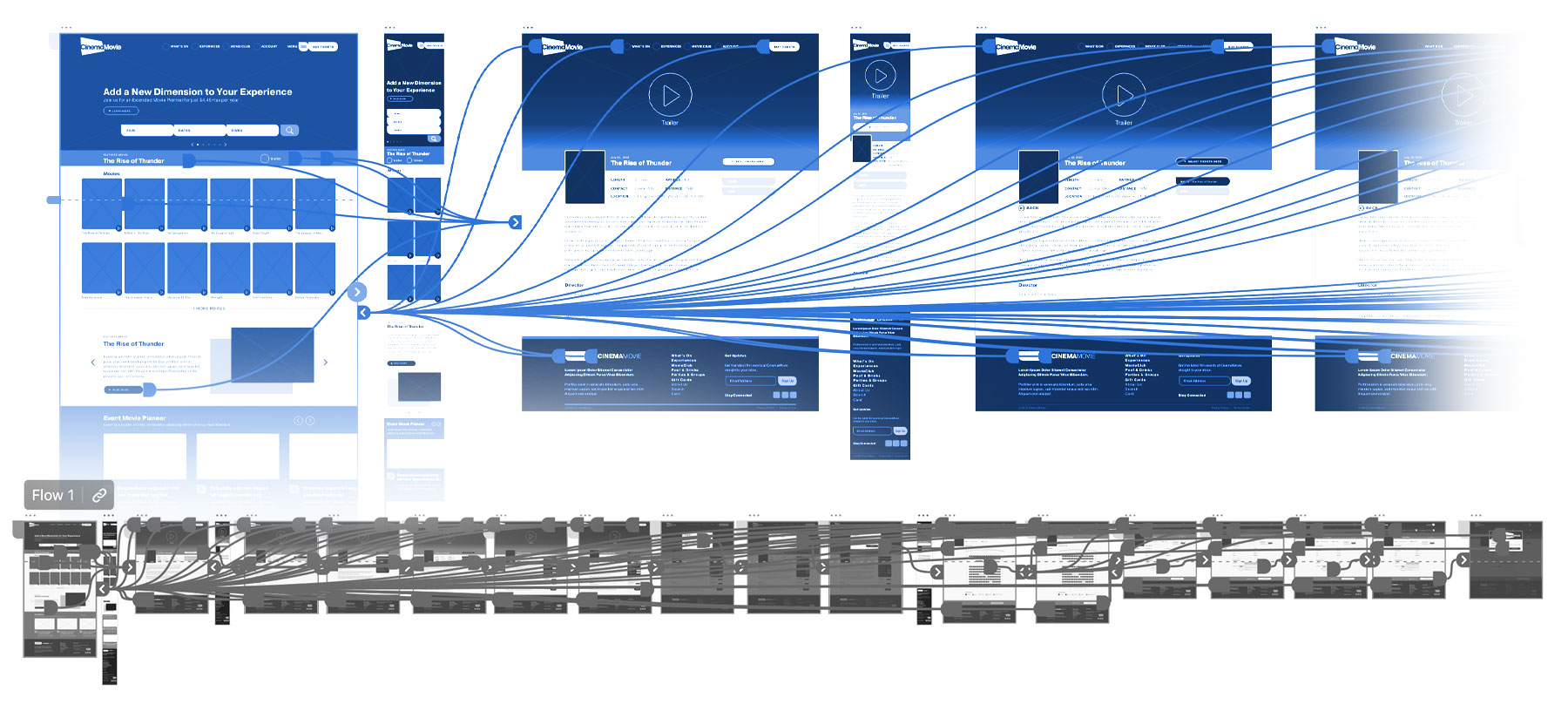
To create a low-fidelity prototype, I connected all the screens involved in the primary user flow, adding interaction to the cart and checking out.
At this point, I received feedback on my designs from my team members about placement buttons and page organization. I made sure to listen to their feedback and implemented several suggestions in places that addressed user pain points.
One of the significant benefits that I learned is to work in a team. Besides the user’s feedback, very precious feedback comes from my team. Working for a long time on a project and getting used to it, I know I can miss some things. A fresh eye and professional feedback help me improve and avoid personal biases.
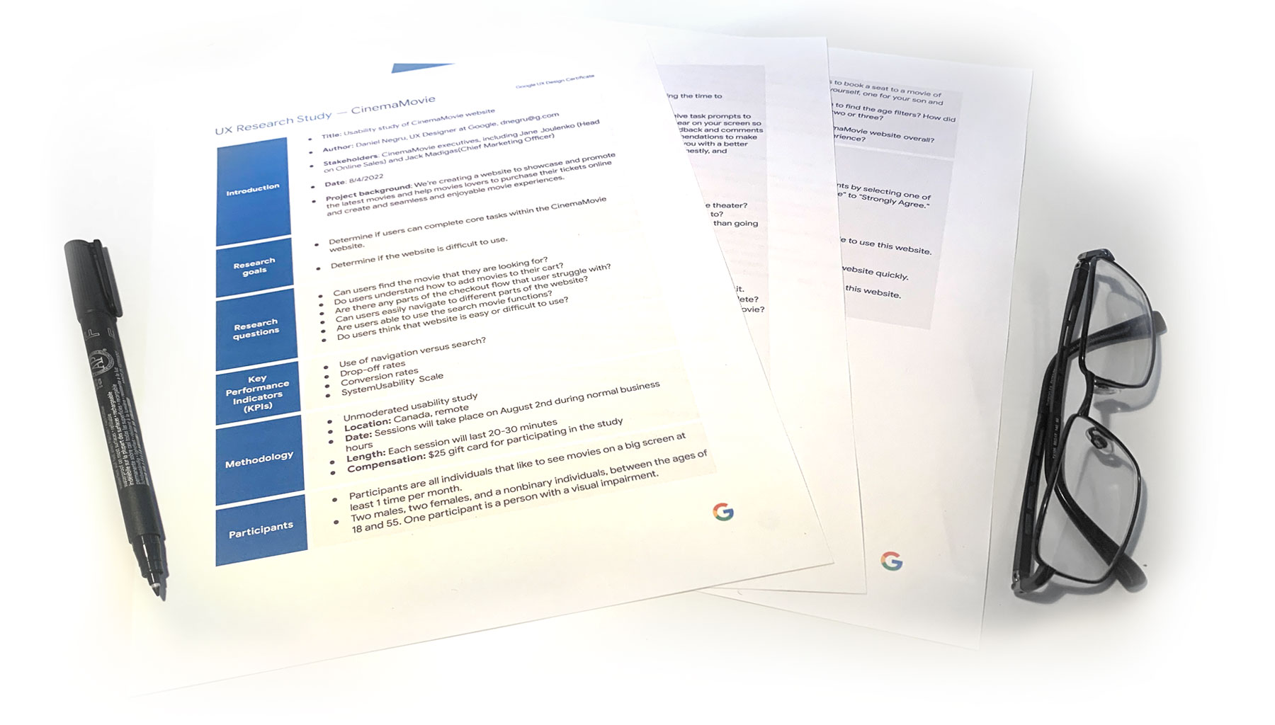
2E. Usability Study
2A / 2B / 2C / 2D / 2E
Now that the design is more defined, it is time for a new usability study. Because I conducted a recent usability study, I found valuable insides and findings that helped guide the design from wireframes to mockups. Please see below the most important ones.
PARAMETERS
Study type: Unmoderated usability study
Location: Canada, remote
Participants: 5 participants
Length: 20-30 minutes
FINDINGS:
Order: In the buying tickets process, users didn’t have a straightforward way to edit the number of persons.
Fulfill: Users couldn’t easily print the tickets if they chose to do it the right way.
Account: During the checkout process, there wasn’t a straightforward way for users to log in to their accounts to pre-fill their previous personal info.
3. Refine The Design
3A. Mockups Changes – Based On Usability Study
3A / 3B / 3C
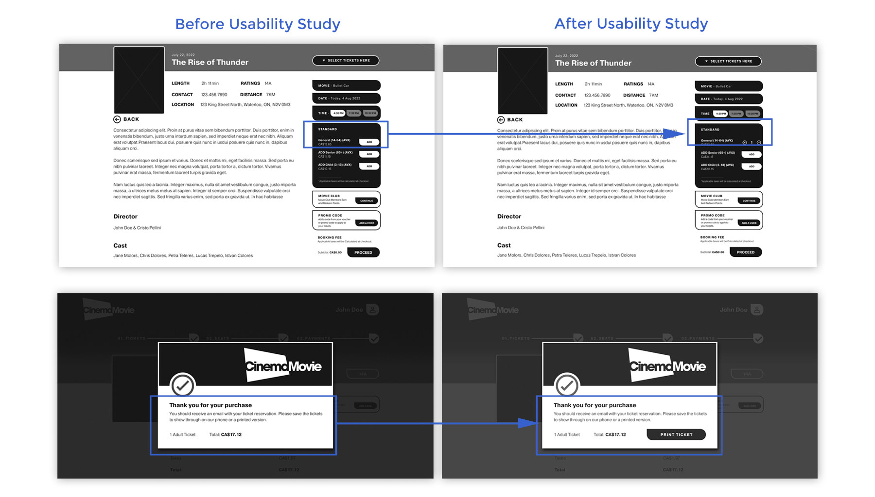
After the gathered feedback, I purchased to refine the design adding features that fix the user’s pain and improve the ordering process.
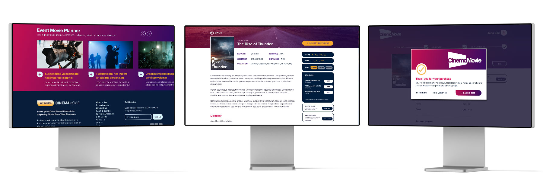
Example 1: Based on the insights from the usability study, I made the changes to make the process more user-friendly and improve the checkout flow. One of the changes adds the quantity options for tickets number using a “+’ or “-” option. I used this feature to allow users to purchase more tickets without starting the process again.
Example 2: Based on the insights from the usability study, I made the changes to make the process more user-friendly, adding a print button at the end of the checkout process. After the tickets are purchased, an automated email is sent to the user to receive the tickets and more information related to the purchase. I added the print button to let users who like to print the tickets do that without going to the email.
Refining the designs is a perfect example of a valuable lesson I learned about what that means to test the products before I put more time and effort into the creation process. Saving time and effort means saving time and money and building a reliable and successful product, thanks to the users.
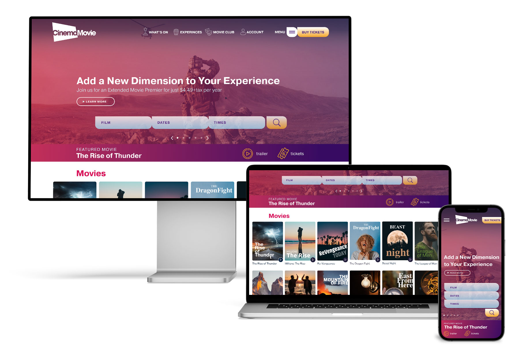
3B. Mockups: Screen size variations
3A / 3B / 3C
At this stage, it’s time to add colours, images, icons and more defined fonts to change my low-fidelity prototype into a high-fidelity prototype. Besides these, I included considerations for additional screen sizes in the mockup based on my earlier wireframes. Because users use various devices to book movie tickets online, I felt it was essential to optimize the browsing experience for a range of device sizes, such as mobile and tablet, so that users will have a seamless experience.
My hi-fi prototype followed the same user flow as the lo-fi prototype. It included the design changes made after the usability study and several modifications suggested by team members.
Once again, I want to underline the Adobe XD software and its capabilities. I was thrilled to learn new software in dept. Because I was a long-time fan and user of Adobe products, I knew that XD was a good and reliable product for building prototypes, but this project once again confirmed the high quality of Adobe products.
3C. Accessibility – Consideration
3A / 3B / 3C
I used headings with different-sized text for a clear visual hierarchy. In addition, I used a higher colour contrast to make the text easily readable.
I used landmarks to help users navigate the site, including users who rely on assistive technologies.
I designed the website with alt text on each page for a smooth screen reader experience.
4. Going Forward
4. Takeaways & Next Step
4A
TAKEAWAYS
Impact – Our target users shared give as positive feedback about the website. Users find the ordering process working as they expected, and they see the process as similar to the other experiences that they had before.
What I learned – I learned to don’t ignore and keep each piece of feedback in my mind when I design or make a reiteration of the design. Each change can significantly impact user experience and needs to be considered. The most important takeaway for me is always to focus on real user needs when I come up with ideas and design solutions.
NEXT STEP
A. Conduct follow-up usability testing on the new website.
B. Identify any additional areas of improvement and ideate on new features.