BeOwner

UX/UI DESIGN PROJECT • Transform a business idea into reality

Be Owner – Owners Helping Owners

Google UX Design Professional Certificate Project

The problem

People didn’t start a business because they didn’t have access to business tools – 29%. They are unsure how to work with the tools/technology needed to run a business – 26%. They didn’t have enough time for a new venture – 25%, and they didn’t have support from friends, family and peers – 23%.


The Product

BeOwner is a Toronto-based organization that helps entrepreneurs to start a business. The organization needs a tool to help people get up and run a business. BeOwner’s primary target includes people between 20-50-year-old that have a business idea and don’t know how to start, get mentorship, obtain finances and build a professional network to make them successful.


The Goal

Design an app and responsive website that will help people with access to information, advice, finances, tools and a business network to start and run a successful business. All of these will be available in one place, in person, and over the internet.


Responsibilities

I conducted interviews and created paper and digital wireframing and low and high-fidelity prototyping. Also, conducting usability studies, accounting for accessibility, iterating on designs, determining information architecture, and responsive design.


My Role:
UX designer leading the CinemaMovie responsive website design


Software:
Figma, Adobe Illustrator, Adobe Photoshop, Miro


Duration:
Aug. to Sept. 2022


Project:
Google UX Design

1. Understand The User

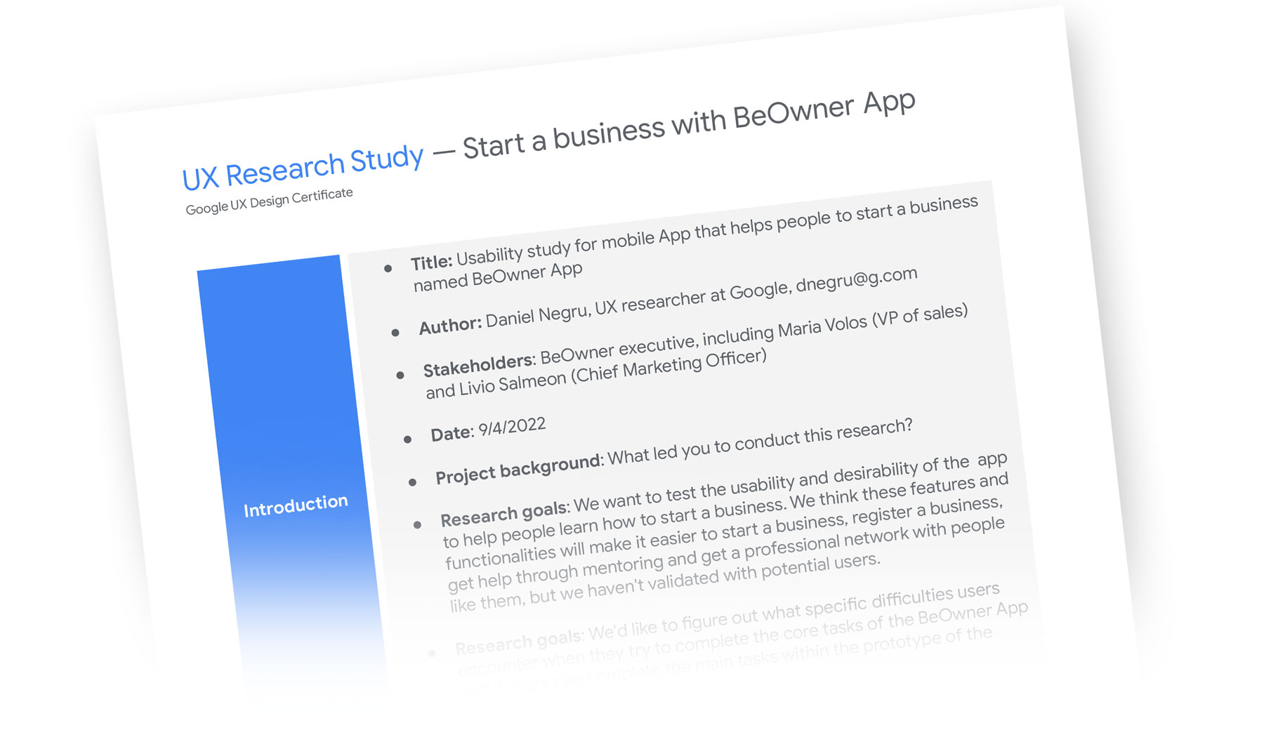
1A. User Research – Summary

1A / 1B / 1C / 1D

I used BeOwner data on how to start a business to develop interview questions, which were then used to conduct user interviews. Most interview participants reported that they have complex filings and problems when starting a business.

However, the research feedback made it clear that users will be open and willing to work with an organization that wants to help them to start a business and continue a successful business.

1B. Personas

1A / 1B / 1C / 1D

Problem statement:
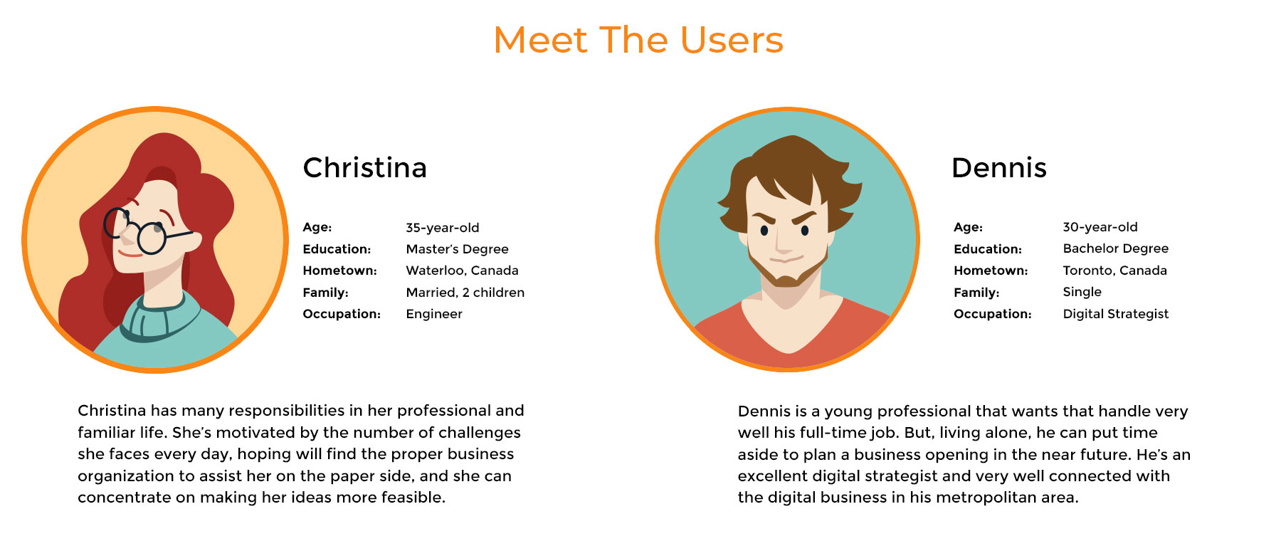
Christina is a working engineer who needs help registering a business process and other assistance related, and because she’s swamped, she wants to have all support in one place

Problem statement:
Dennis is a digital strategist with a plan to start a business, but he needs help on the legal side of the business creation that will let him concentrate on perfecting his business plan.

1C. Competitive Audit

1A / 1B / 1C / 1D

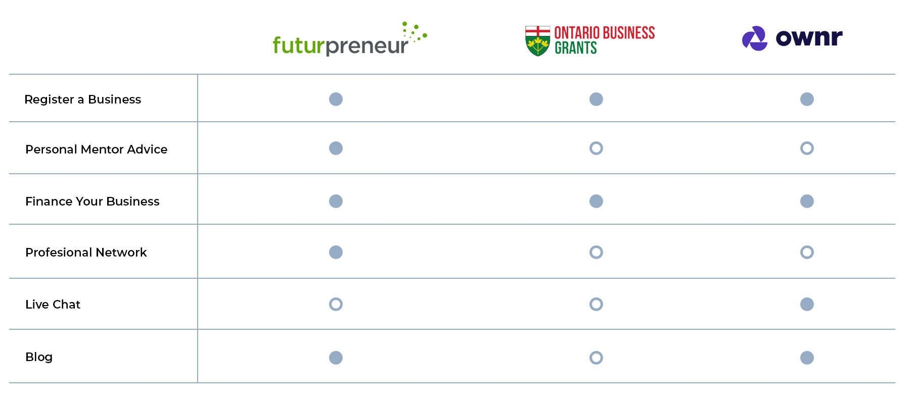
To understand the competition and to determine the key opportunities that BeOwner can have above the competition, I performed a Competitive Audit.

Auditing a few competitors’ tools and products provided direction on gaps and opportunities to address with the BeOwner app.

1D. Ideation – Crazy Eights

1A / 1B / 1C / 1D

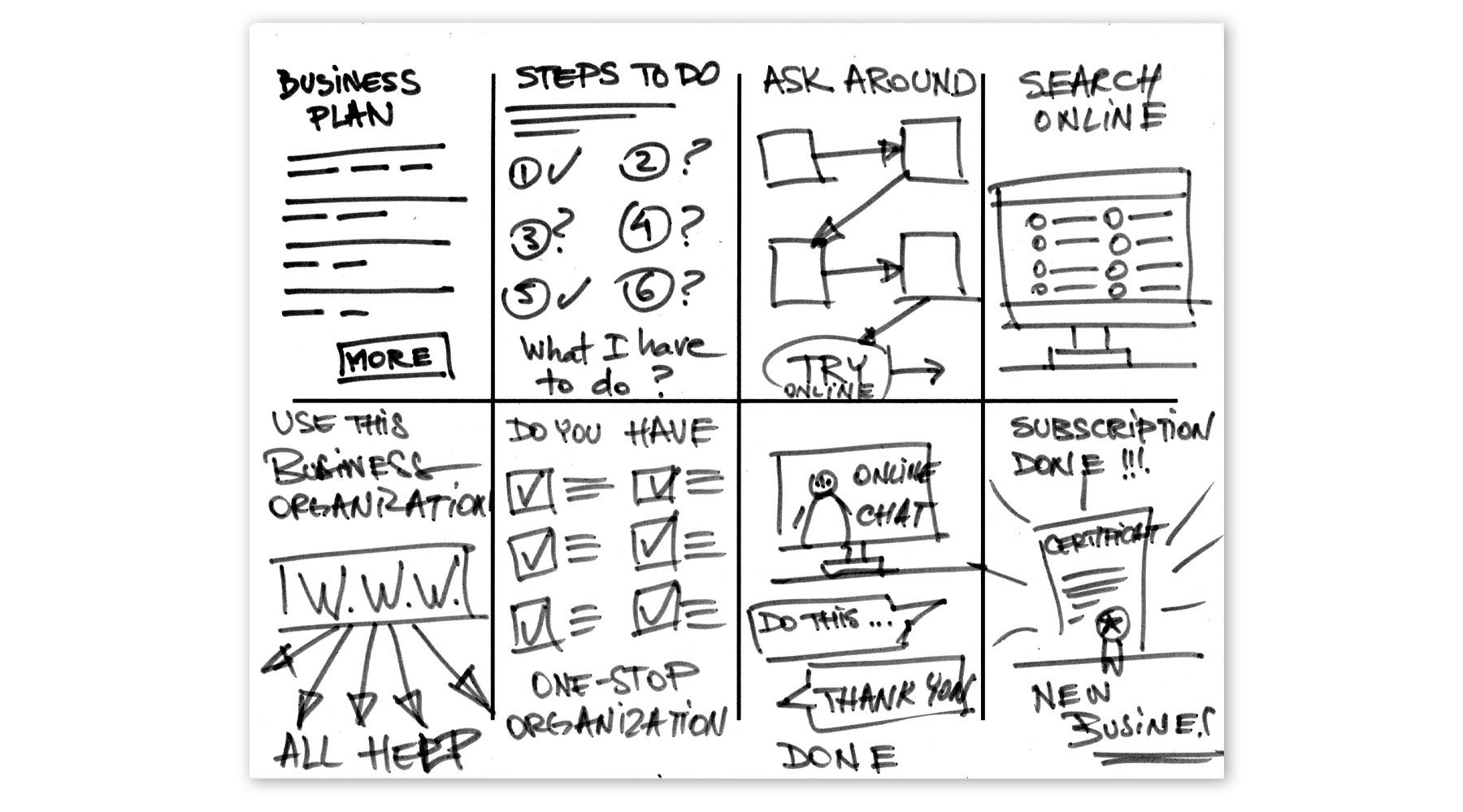
I did a quick ideation exercise to come up with ideas for addressing gaps identified in the competitive audit. My focus was explicitly offering solutions to start a business and adjacent services all in one place.

2. Start The Design

2A. Digital Wireframes

2A / 2B / 2C

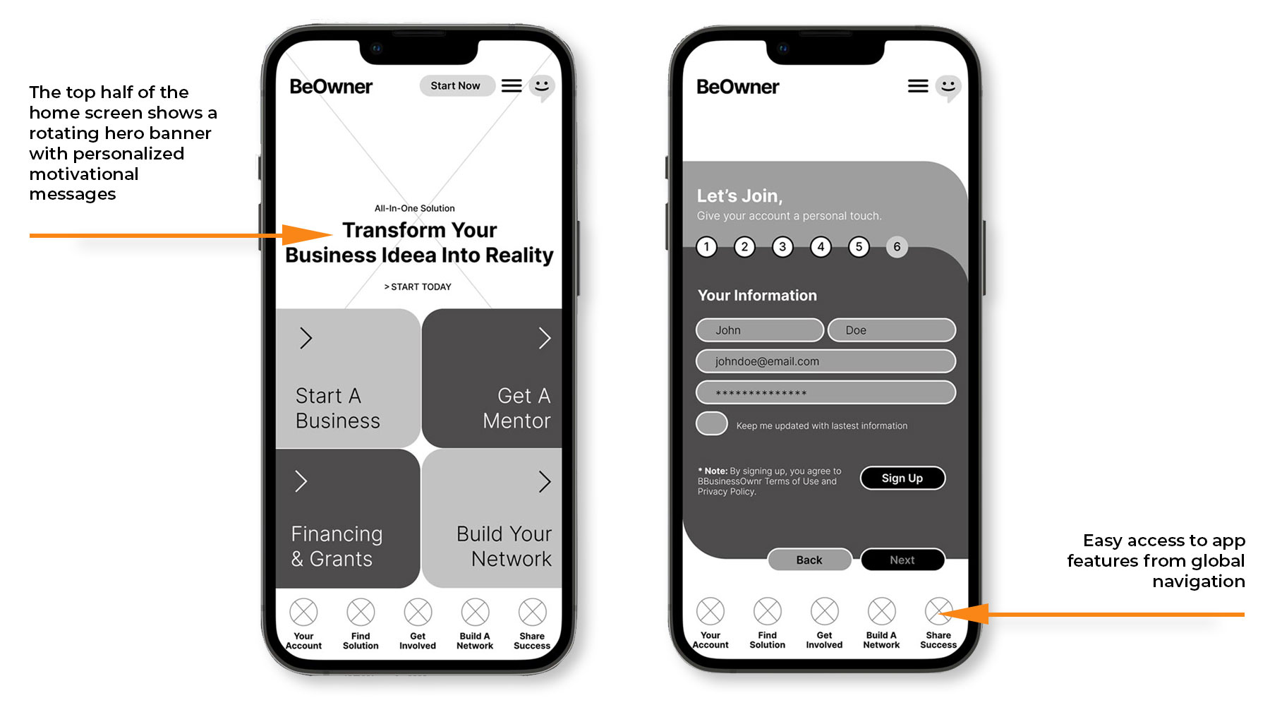
After ideating and drafting some paper wireframes, I created the initial design for the BeOwner app. These designs deliver personalized guidance to users who need help starting a business.

2B. Low-Fidelity Prototype

2A / 2B / 2C

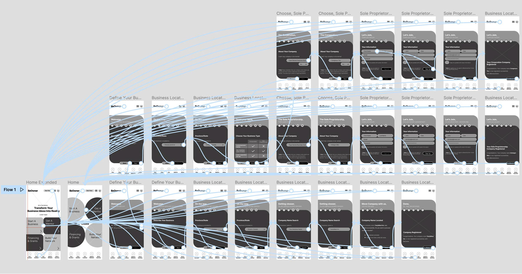
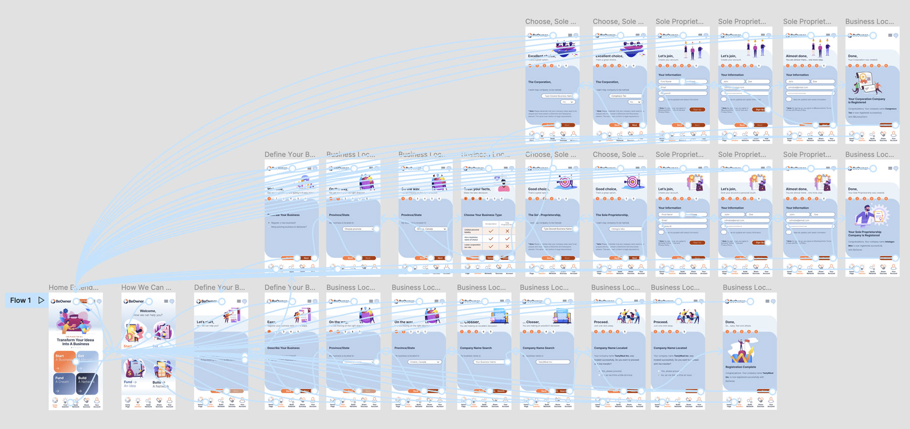
To prepare for usability testing, I created a low-fidelity prototype that connected the user flow of viewing how a business can be legally registered or transferred to be a BeOwner organization.

2C. Usability Study – Parameters

2A / 2B / 2C

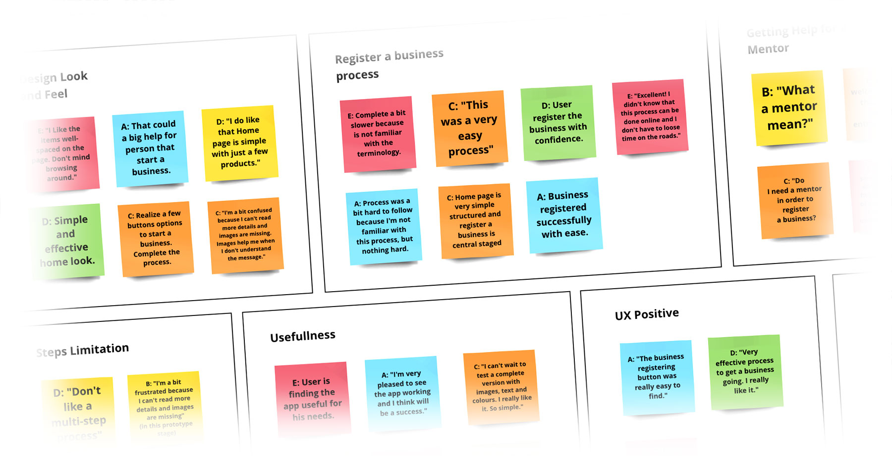
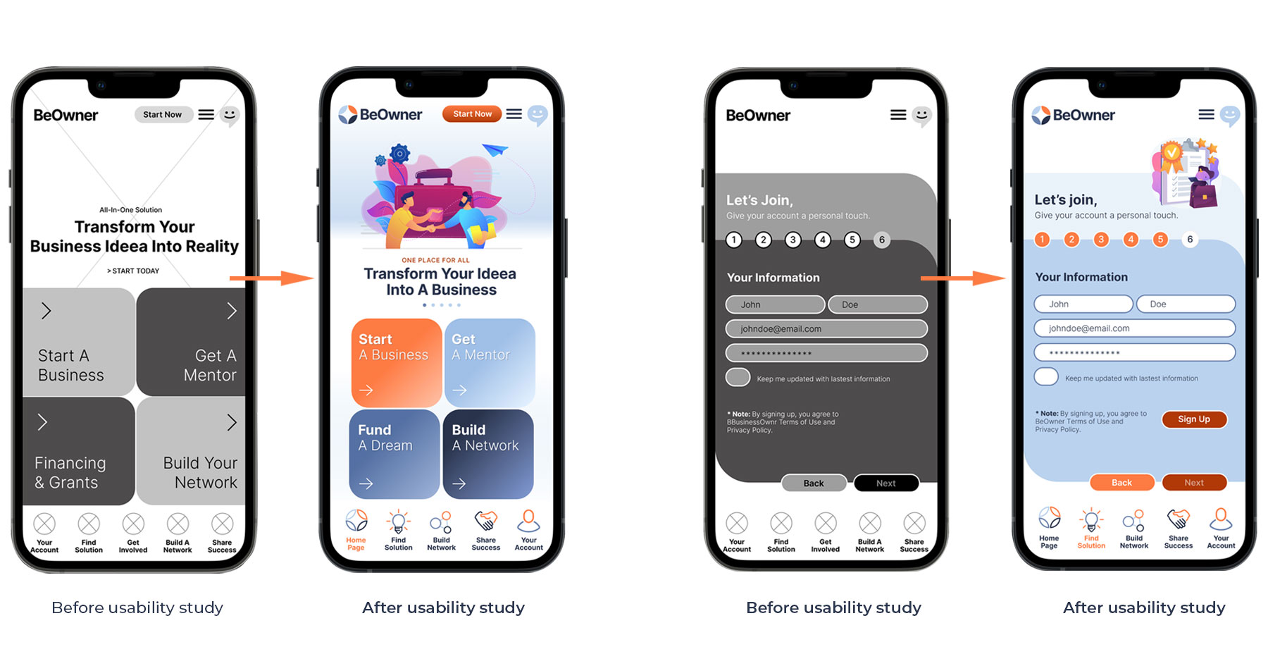
I conducted a usability study, and the findings from the study helped guide the design from wireframes to mockups. These were the main findings uncovered by the usability study:


PARAMETERS
Study type:
Unmoderated usability study
Location: Canada, remote
Participants: 5 participants
Length: 30-60 minutes


FINDINGS:
Solution for a new business:
People want easy access to solutions to help them start a successful business.
Register a business: People had difficulty going through the legal process of registering a company.
Transfer a business: People preferred clear indications of the solutions offered and clear messages about the benefits BeOwner offers.

3. Refining The Design

3A. Mockups

3A / 3B / 3C

Based on the insights from usability studies, I applied the design changes, like providing a clearly defined area for the main call-to-action. For example, I added white space, brought colour, and highlighted the four main categories BeOwner covers.


Additionally, I perfected the sign-in process, taking out unnecessary steps and making fields and options more visible and apparent. Finally, I created the main navigation where I added a Home Page and a Your Account Page that let users access the main important features in the navigation.

3B. High-Fidelity Prototype

3A / 3B / 3C

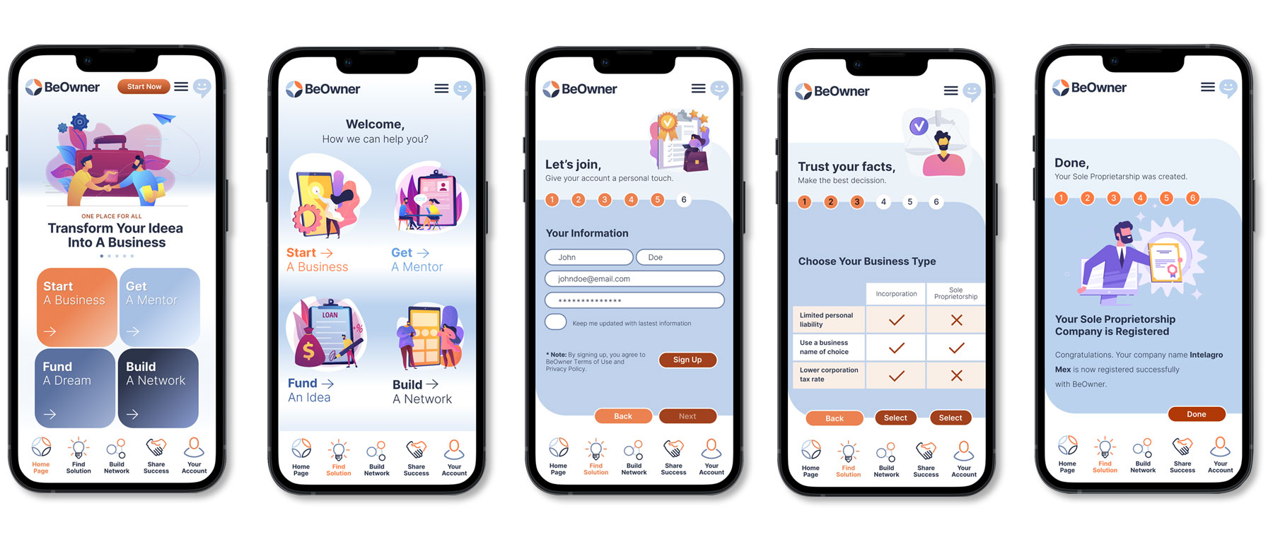
The high-fidelity prototype followed the same user flow as the low-fidelity prototype, including design changes made after the usability study.

3C. Accessibility – Considerations

3A / 3B / 3C

First Consideration
Clear labels
for interactive elements that screen readers can read.


Second Consideration
The initial focus of the home screen on personalized recommendations helps define the primary task or action for the user.

3. Refining The Design

4A. Information Architecture

4A / 4B

Site Map for Responsive Website
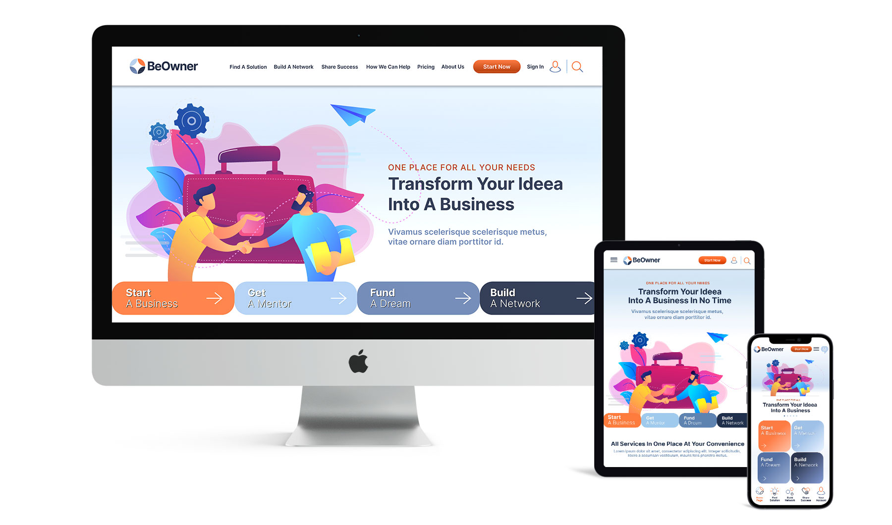
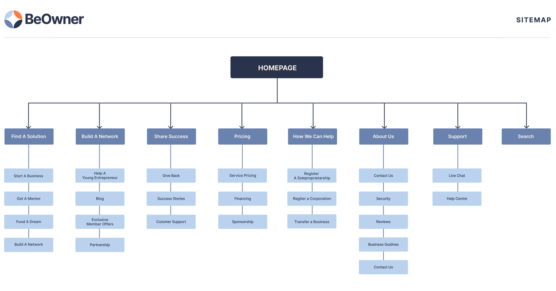
With the app designs completed, I started work on designing the responsive website. I used the BeOwner sitemap to guide the organizational structure of each screen’s design to ensure a cohesive and consistent experience across devices.

4A. Information Architecture

4A / 4B

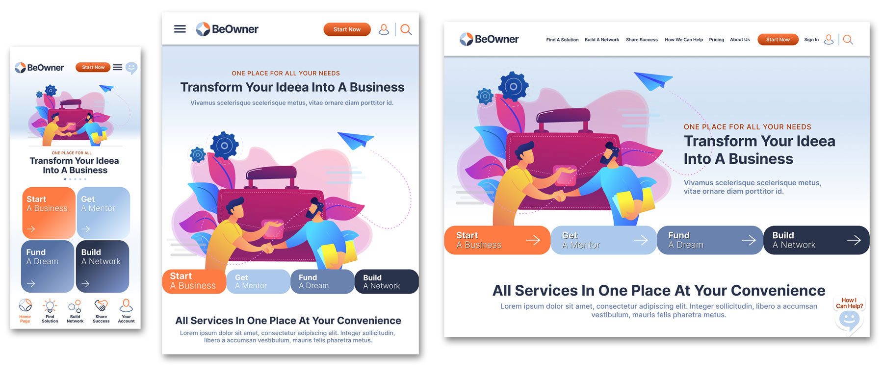
Mobile • Tablet • Desktop
The designs for screen size variation included mobile, tablet, and desktop. I optimized the designs to fit the specific user needs of each device and screen size.

5A. Takeaways & Next Step

5A

TAKEAWAYS
Impact:
Users shared that BeOwner has trustable applications that help start a business successfully. One quote from peer feedback was that “the BeOwner app helps me in the business registration process, and I can concentrate on perfecting and refining my business idea.”


What I learned: I learned that even though the problem I was trying to solve was big, diligently going through each step of the design process and aligning with specific user needs helping me come up with feasible and valuable solutions.

NEXT STEPS
1. Conduct research on how successful the app is in reaching the goal of helping people to start their businesses.
2. Add more educational resources for users to learn how to start, fund and create a business idea. In addition, offering mentoring advice brings extra confidence.
3. Emphasize on provide robust solutions, connections and encouragement to users for successfully using BeOwner solutions.