Arkhitekton Studio

WEB DESIGN PROJECT • Plain Beautiful Architecture

Arkhitekton Studio – Plain Beautiful Architecture

Professional Project

The Product

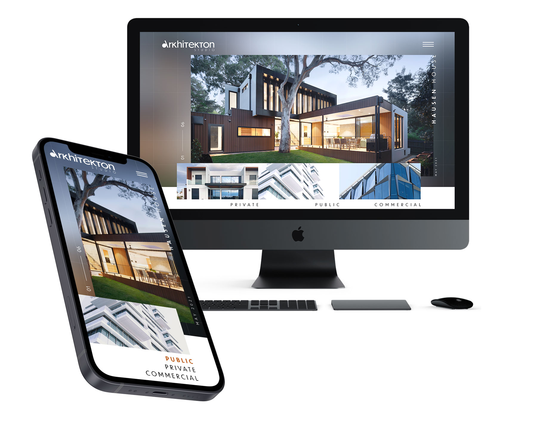
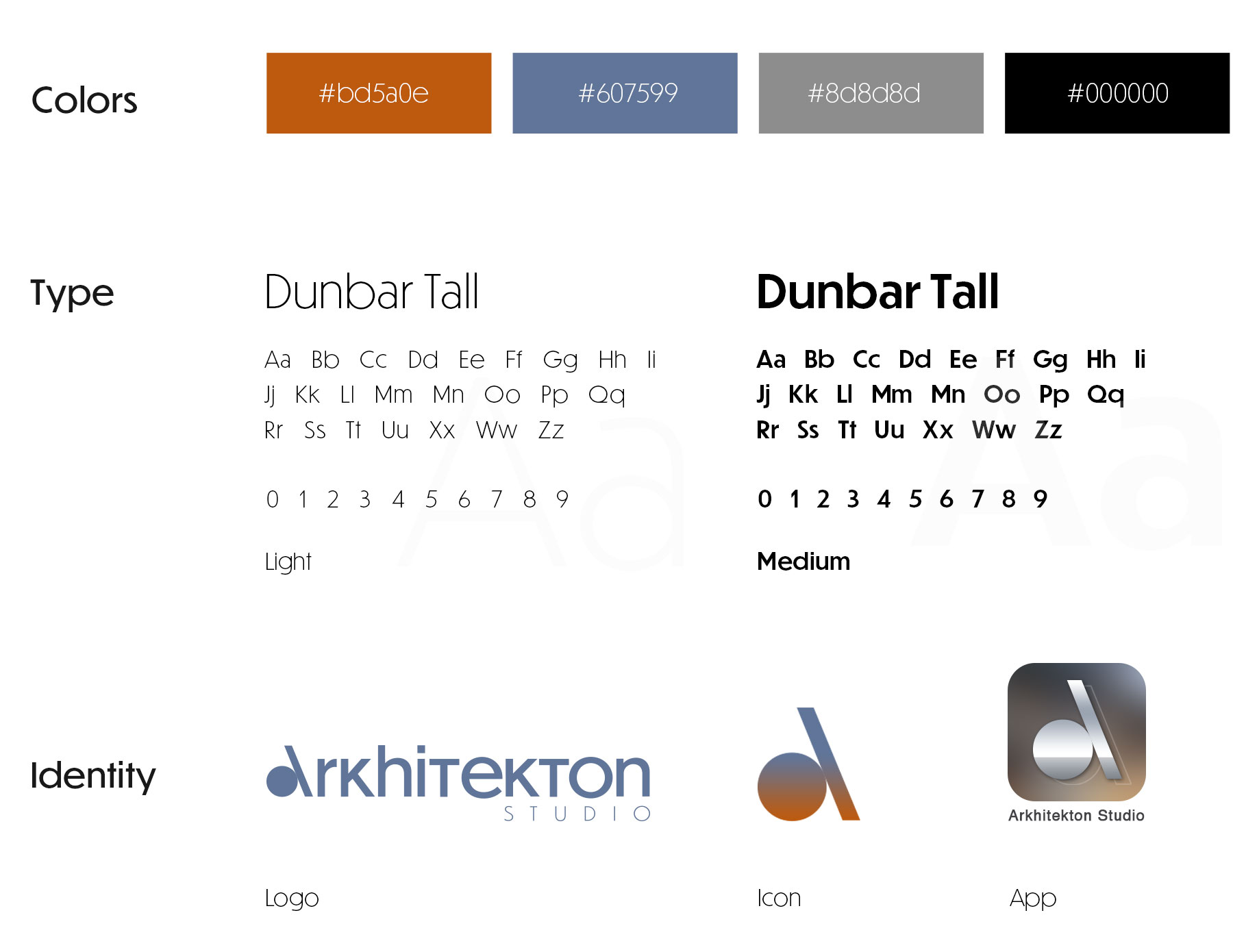
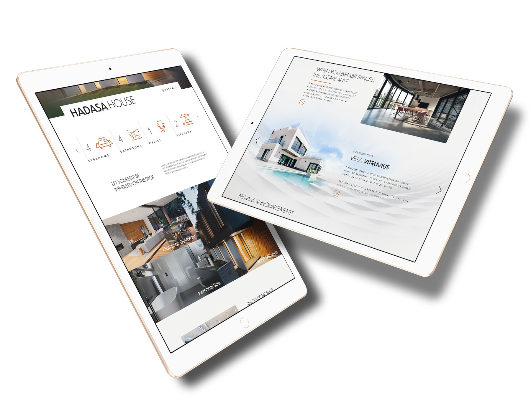
Arkhitekton is a modern and dynamic architectural studio in beautiful Tel Aviv, Israel. Motivated and creative architects, designers and engineers have a clear vision to make every space a highly natural and habitable space. Their typical audience wants an exquisite and uniquely private, public or commercial space.
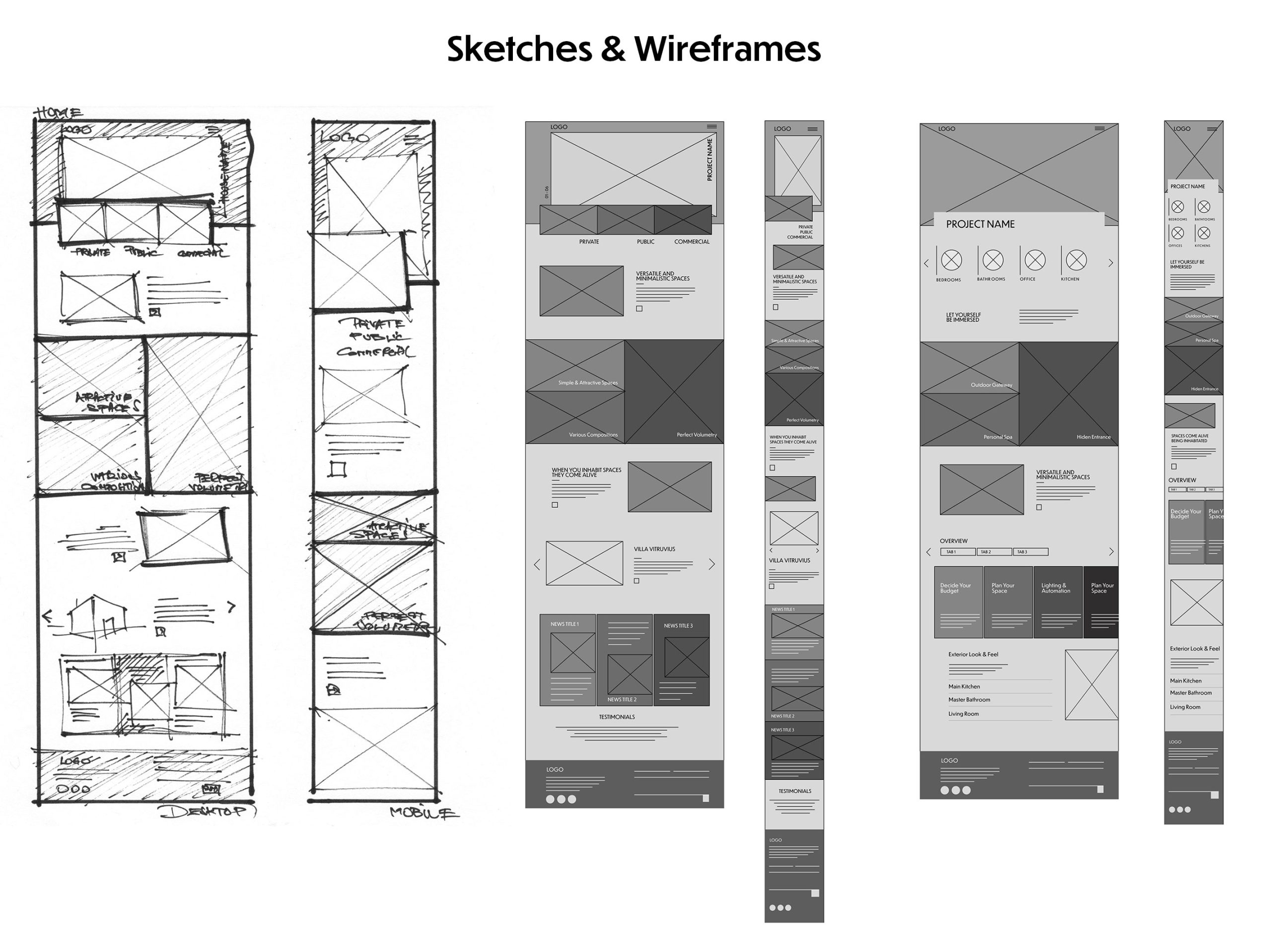
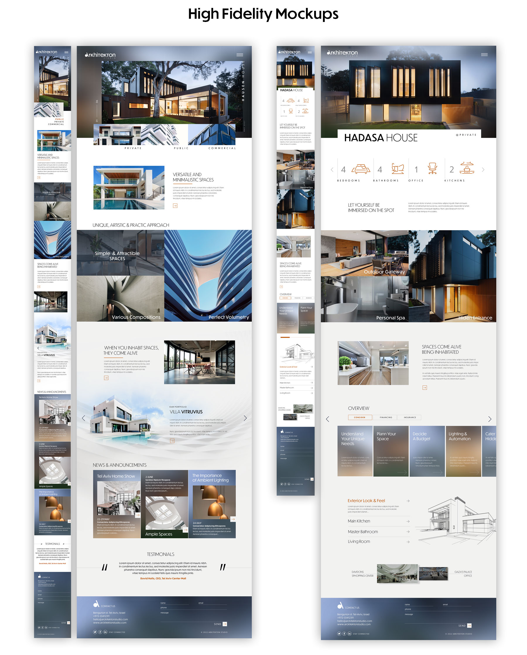
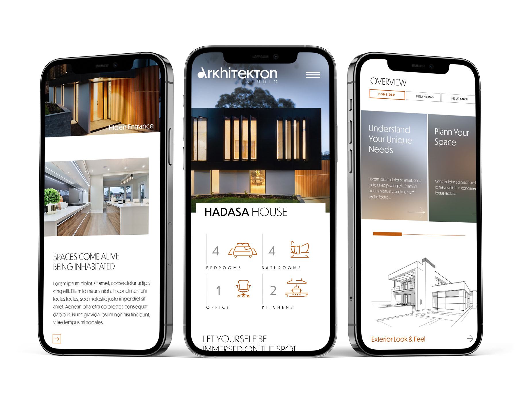
 

The Goal

Design an intuitive Arkhitekton website to convert visitors into clients using not a detailed message but just presenting their creations with a minimal message. Arkiteckton studio believes that its work will play a significant role in delivering its message without words.

The Problem

Picking the right design and style can be a problem for a client who needs to be guided to a process that combines his preferences and requires professional standards to deliver excellence. The website wants to open client appetite to quality products rather than to offer solutions.


Responsibilities:

I was conducting interviews, paper and digital wireframing, low and high-fidelity prototyping, usability studies, accounting for accessibility, iterating on the design and responsive design.

My Role: 

Leading UX/UI designer

Scope: 

Arkhitekton responsive website

Software: 

Figma, Adobe Illustrator & Photoshop

Duration:

January to March 2022

1. Project Vision

Arkhitekton Studio is a high-class architectural firm whose work is the best recommendation. Starting from this premise, we decided to let the website display its unique creations, let the images take the lead, and use the text to sustain the message. As a result, this online presentation’s straightforward message showed thorough space, shapes and colours.


Arkhitekton is an architectural studio that wants a classy and direct online representation, using a goal-directed method that puts in prim-plan persona creation and needs to achieve this goal. Therefore, the minimum viable product for this project was to design a responsive website and, in the future, a dedicated mobile app.


Challenges:

  1. Choose a direct approach without too many introductions
  2. Design an intuitive and user-friendly interface 
  3. Create a minimalistic UI to feature the project upfront
  4. Display a clear and compelling process for each architectural project

2. Meet the users

As a start, I used the goal-directed approach, which was fruitful in our design process. Then, the foundation for this approach, I used the qualitative research method, which proved to be adequate. The research tools used were competitive analysis, stakeholder interviews, industry literature, team meetings, and the very important persona creation.

3. Competitive Analysis

In order to immerse and understand in-depth the industry standards and conventions, I performed a competitive benchmarking. For this purpose, I use a few competing companies, but none of them direct competitors, but some of these can compete with Arkiteckton Studio, affecting the popularity and revenue.


Arkhitekton Studio’s most important advantage lies in the quality of work, even if the competitors are striving to offer similar services. The main benefit that Arkhitekton Studio has is to be a one-solution company for all client’s architectural needs, helping users from start to end, teaching them and offering viable solutions.


Differences:
1. Simplified Approach vs Busy Approach
2. Minimalistic Interfaces vs Abundant in Details
3. Easily Accessible vs Complex Access
4. Images vs text

4. Website Sitemap

After we put together the sitemap, the next step was to put the pen o paper to draw the website pages. Then, with the previous research in mind, I make sketches for mobile (iPhone 13) and desktop screens (iMac).

Drawing low-fidelity sketches is a quick and effective process that I created step by step the main important pages where I make the layout and the look. In my compositions, I draw the vital elements using accurate text for main titles and headlines and greek text to show the amount and copy needed. The number of details in the concepts will help later when I transform the drawing into wireframes and wireframes into a low-fi prototype.

4. Low-Fidelity Sketches & Wireframes

I started by laying down some sketches to transform my vision into paper, and the sketches were changed into wireframes. Working with architects and designers was a very challenging experience, and it was a pleasure to interact with stakeholders and professionals deeply immersed in recent design trends in styles. In the process, I had the opportunity to understand firsthand how they approach the client, how they interact with clients and their creation process.

For the website’s composition, I used big images, minimal text information and a lot of white. Very high-class fonts and very sharp, stylish colours and bluish backgrounds. All these alternate in the compositions, having visual interest points that draw the eyes to a simple and clear message.

Big blocks of images are illustrations of the quality of work, and alternating clear structure enforces the message.

5. Iterations

To get feedback on the newly created prototype, we prepared a 15-question survey for participants to answer before the usability test. The 10 users were asked to do different tasks in our prototype, and we collected the feedback we’ll be used in the next iteration.


Modern – I found that users received the modern look of the website very well, but they want to receive information as well. We reviewed each page to establish a good balance of information and visual images.


Clear – I wanted the users to be able to read and understand the message that needs to be quick and straightforward. Most users reacted negatively, from the boring message to the complex issues like interactivity. So we improved the message (both text and visual) to be clear and relevant.


Too many clicks – On some actions, users had more than one click to get to the information they were looking for. This important highlight reminded us of the idea we first used – one-click action. This usability study helped review the faulty processes and make them straight and easy.

6. Identity

For the company logo creation, we chose the circle and line to create an icon that will be part of the logo text. I highlighted the “A” because it is a starting point for the words Arkiteckton and the alphabet. Arkiteckton generates a world of habitable environments that opens unlimited possibilities and perspectives. Therefore, “A” can work very well separately as an icon or on an app thumbnail or be part of the primary word.


Website iconography has a minimalist look with clean and modern lines. But, like Arkiteckton’s creations, the icons are kipping just the essence, the minimum of shapes that help to convey the message.


For the website typography, we chose The Dunbar Tall text, which gives the website a rich and bright tone. In addition, a very easy-to-lecture font cut offers viewers an alternative message that matches the style of created shapes proposed by Arkiteckton.

7. Takeways

As a longtime Visual and Web Designer, I am confident that designing the Arkhitexton Studio website and company identity was a process dear to my heart. That was an extraordinary opportunity to express myself on a very generous subject from a visual standpoint and saturated with meaning. For this project, I used the goal-direct design process. I appreciate focusing on the persona hypothesis creation to promote the goals. However, I learned from this design process that designing exclusively for business goals will not produce desired results and will most likely fail.