Spark

WEB DESIGN PROJECT • Sparking the passion for creativity

Spark Communications – Sparking the passion for creativity

Professional Web Design

A Spark of Creativity and Ingenuity

Responsive Web Design

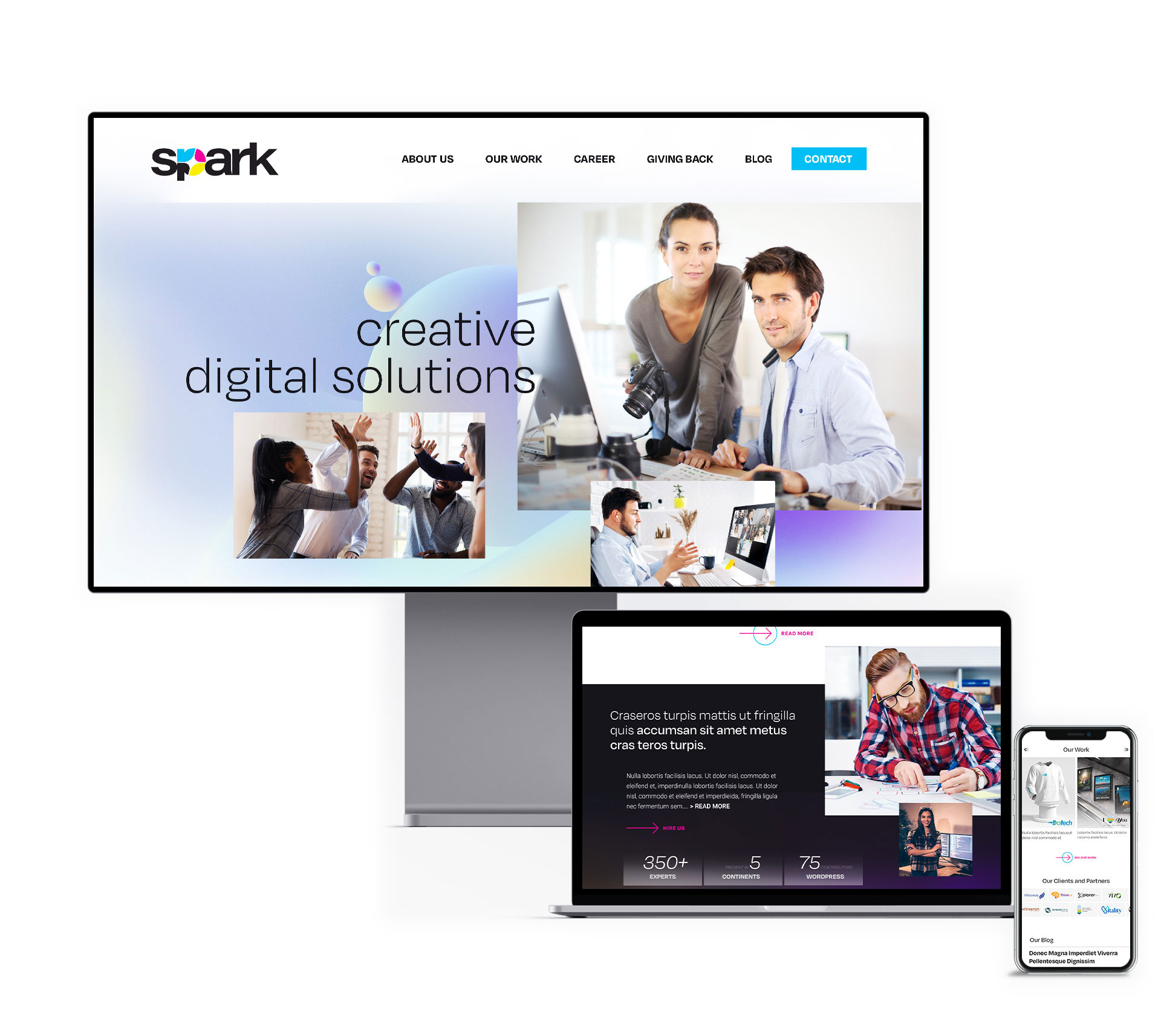
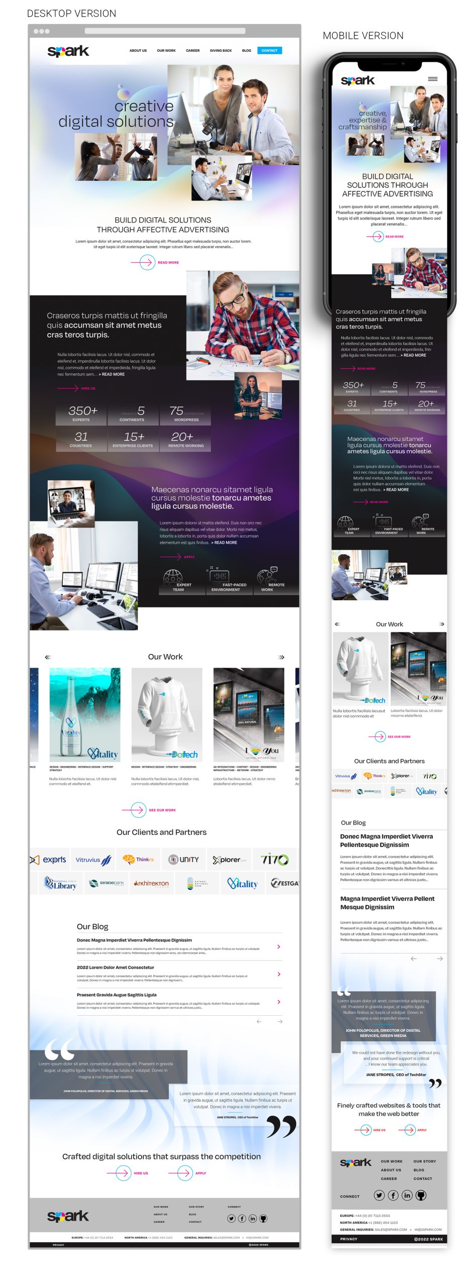
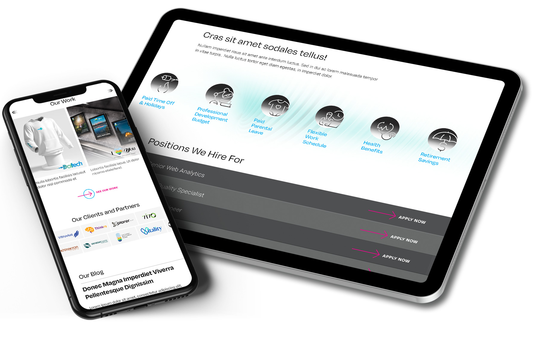
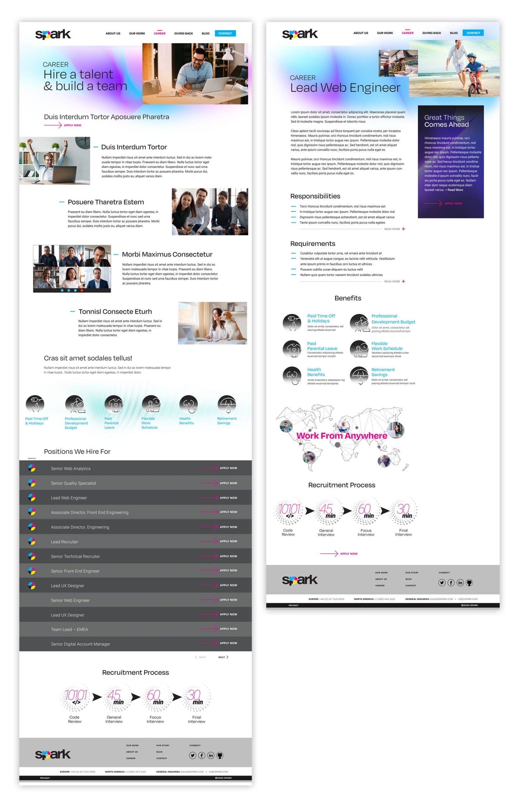
Project brief: Spark Studio is looking for a fully responsive online presence that presents its strong points and high-quality services as a creative agency, a one-stop shop for all creative needs. 

The problem: Most of the competition websites are challenging and have complex interactions. Unfortunately, those unnecessary complications frustrate users in finding the relevant information and solutions they need to address.

Design goal: In addition, sparks want an effective and intuitive website that clearly understands its users’ needs and offers an excellent opportunity for professionals that wants to strive in their carrier. 

Corporate Identity

To create the business identity, I picked three main elements as a starting point:

  • SYTMBOL – Center Marks symbol
  • COLOURS – Cyan, Magenta, Yellow, Black 
  • ICON – a sparkle icon

Spark is a powerful brand built at the interference of the primary colours – Cyan, Magenta, Yellow, and Black with the Helvetica bold font word – spark. Strong and powerful letters clearly communicate that a spark of creativity and ingenuity is about to happen. For example, the letter “P” was shaped dynamically with the sparkle icon, and the four primary colours were embedded to give various chromatic treatments.

CONCEPT

When it comes to the composition, the main page was structured to offer a strong concept of providing quality services and accepting quality services for professionals that strive in the industry. Around the two ways to hire Spark or to be hired by Spark, I build messages that enforce the quality of work – portfolio and testimonials and a few facts are presented to help users visualize the company resources.

DESIGN

The look and feel of the website are clean and modern, filling the screen and alternating white spaces with images and short blurbs of text. The Regular and Roboto fonts offer a clean cut for the text that is easily readable. Images are bright and inviting, depicting moments and activities from the agency’s day-to-day life.

IMPLEMENTATION

From a technology standpoint, we picked WordPress to be the platform that displays the website. A responsive online solution that fits every screen and displays the website message seamlessly. We treated the website size and images, reducing the size to be easily downloadable. We know that users’ patience is limited, and a website to convert needs to work perfectly.

Learnings & Benefits

From this project, I learned that a good combination of success for any creative project is to find the perfect combination between the business goals and user expectations. Putting the user upfront and frontal, understanding user needs and pain points and coming up with a proactive approach are vital requirements.

Another learning is to make sure, as a UX/UI Design approach to not make assumptions and constantly question and validate hypotheses with your target users. It is essential to understand the user’s perspective and listen to their problems, needs, and frustrations. Successfully address and solve any situation that could infringe on your users’ confidence level.

I learned to listen to the stakeholders’ needs and vision and ensure that I meet and exceed their expectations, and finding solutions is my job.