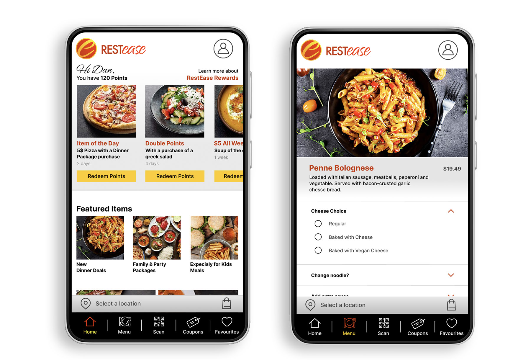
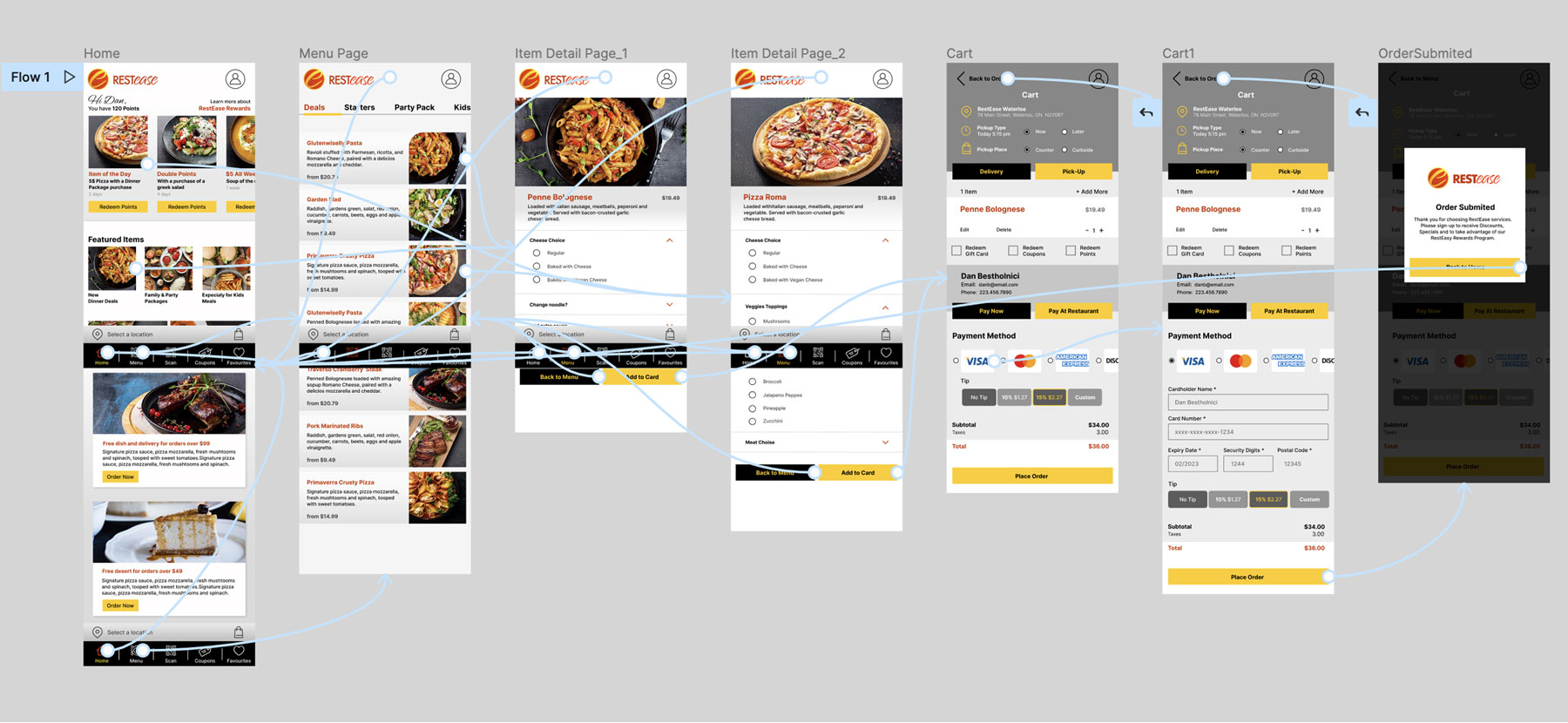
RESTease

UI/UX DESIGN PROJECT • Seamless Restaurant Experience

RESTease – Seamless Restaurant Experience

Google UX Design Professional Certificate Project

Project Goal

RestEase is a national restaurant chain that strives to deliver excellent culinary menus and services across Canada at accessible prices, specials, deals and discounts. RestEase targets customers that are professionals or young families that are busy and don’t have time to prepare their meals and university students with a limited budget. In addition, ReastEase is looking to reward returning customers with reward points that can be used against orders.
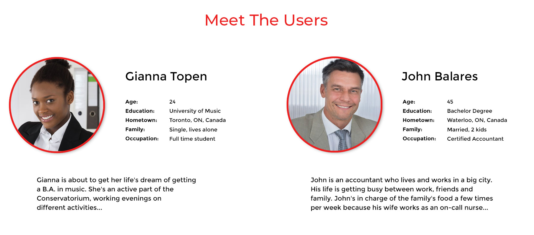
 

Target Audience

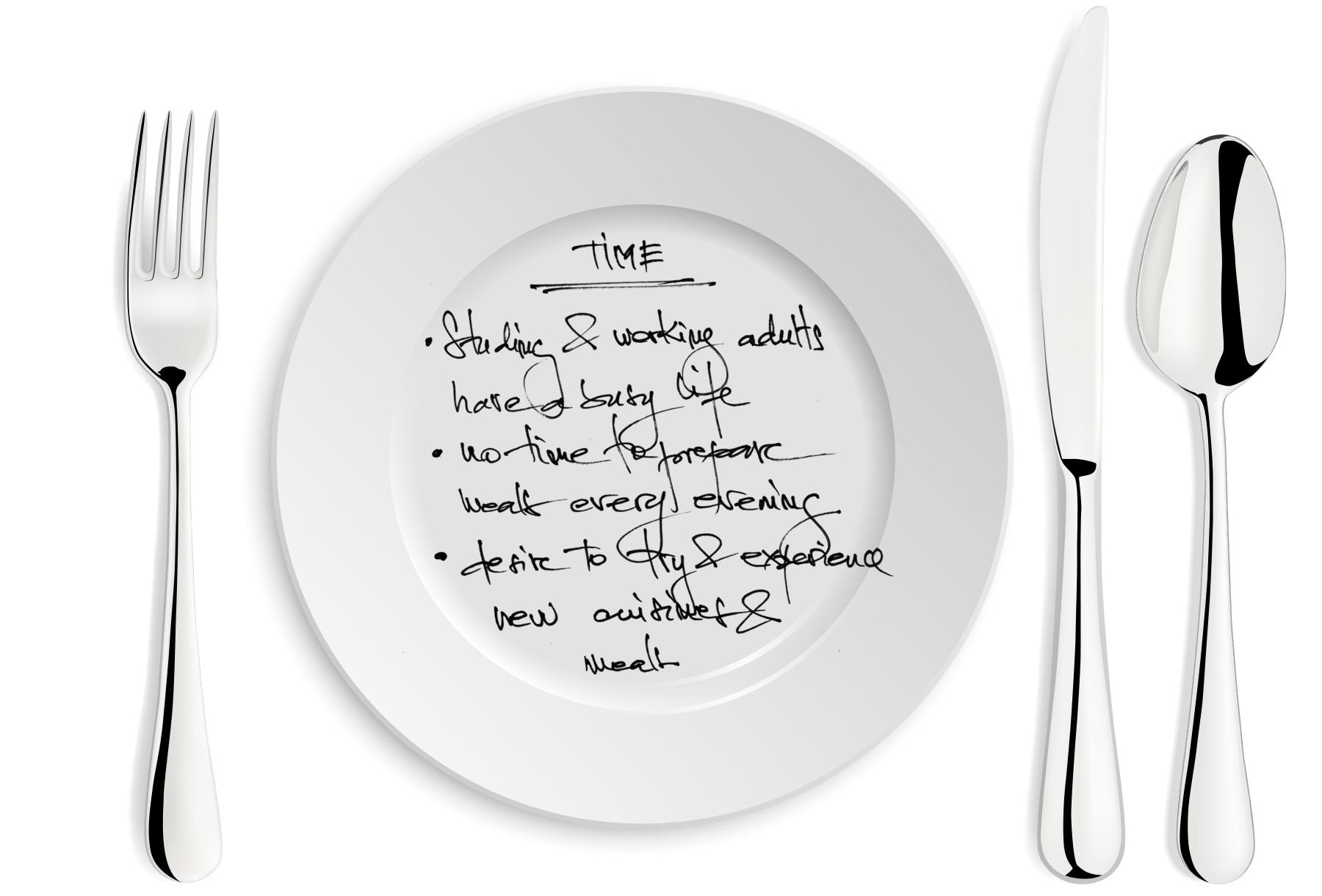
Target Users are busy professionals, young families with busy schedules that don’t have the time to prepare a meal and university students with limited budgets.

Key Challenges

Design an app for RestEase Restaurants that allows users to place and pick up orders at advantageous prices easily. In addition, the app will address users looking for a quality menu at discounted prices.

My Role:
UX designer leading the RestEase App design

Duration:
Jun. to Aug. 2022

Software:
Figma, Adobe Illustrator, Adobe Photoshop, Miro

Project:
Google UX Design

1. Understand The User

1A. User Research
Interview & Pain Points

1A / 1B / 1C

INTERVIEW
I conducted interviews and created empathy maps to understand the users I was designing for and their needs. For example, a primary user group identified through research was working adults that don’t have time to cook meals.

This user group confirmed initial assumptions about ordering food from a restaurant through a mobile app. Still, research also revealed that time is not the only factor motivating users to buy from restaurants. Other problems included career challenges, personal preferences, comfort, variety of choices, and sales values that encourage users to buy food instead of cooking at home.


> See User Research Interview notes


PAIN POINTS:

1. TIME: Studying and working adults are way too busy and don’t have time to prepare meals at home.
2. PRICE:
Budgeting the resources is something that a student needs to do. Earning extra money helps, and saving on meals is helping as well.
3. DISCOUNTS:
Looking for price-attractive meals on the menu makes clients happy to save money. Unfortunately, sometimes specials and deals are not listed or are hard to find.
4. QUALITY:
Eating healthy is not a trend but a necessity for an adult. Therefore, listing the additives, ingredients, and calories is a must, not on individual items but meal menus.

1B. Personas

1A / 1B / 1C

Gianna is a 24-year-old female student and evening worker who needs to order food from the restaurant because she has no time between day courses and an evening job to cook at home.


John is a 45-year-old accountant who lives and works in a big city. His life is getting busy between work, friends and family. John’s in charge of the family’s food a few times weekly because his wife works as an on-call nurse.

1C. User Journey Map

1A / 1B / 1C

The interviews and the user personas revealed how helpful it would be for users to have access to a dedicated RestEase App to order and pick up food orders from their RestEase favourite restaurant. In addition, the necessity to access special requirements like discounted prices, nutrition values and meal components proved that an easily accessible and information-based application would be vital for users.


From the research process, I learned how essential it is to understand the users and their needs to lay a solid foundation for a successful future project.

2. Start The Design

2A. Paper Wireframes

2A / 2B / 2C / 2D

For this exercise, I created the draft iterations drawing six different Home page compositions on paper. In addition, I ensured that the concept’s design elements adequately addressed user pain points and that they met the user’s needs. After that, I chose individual perfect elements* from each screen and prepared a home screen composition.


* Please see the green star signs that mark the elements I would use in the initial digital wireframe.

2A. Digital Wireframes

2A / 2B / 2C / 2D

I created a Home Page screen that reflects the user research feedback and findings following the design phase steps. Specials and deals are front and center, and a point program encourages customers to come back to enjoy bundles and specials.


Easy swiping and space-saving Menu navigation let the user browse between various meal offers. In addition, I wanted the app to help users quickly navigate from big pictures to small detail. Every week featured products can be purchased on the points-based system by the users, enabling users to save money and reward their loyalty to RestEase restaurants.


*Please see the below digital wireframes illustrating the RestEase app vision.

2C. Low-Fidelity Prototype

2A / 2B / 2C / 2D

Adding interaction to the low-fidelity prototype was the next step I took in the Design process, connecting the primary user flow of the restaurant ordering app. In addition, the newly created prototype will be used in user usability studies.


Regarding the ordering process, I thought it would be appropriate to start the app with the onboarding process, choose the favourite restaurant location and then the ordering process. Later after the usability study, I realized a few valuable insides I’ll uncover subsequently in the process.


That was a valuable lesson that I learned to not rely on my personal biases but to put the user and their needs first and upfront.

2D. Usability Study – Findings

2A / 2B / 2C / 2D

The next step after creating the low-fidelity prototype was to conduct usability studies to validate my prototype by the users. I completed two rounds of usability studies that revealed findings from the first study that helped guide the design, from wireframes to mockups. The second study used a high-fidelity prototype and showed what aspects of the mockups needed refining.


Round 1 findings
1. User wants to have a clean page with well-spaced and fewer items
2. User more upfront details about the points and reward program
3. User wants to enter private info just at the end or order as a guest


Round 2 findings
1. User wants to have a clear reference to the Party Packs and Deals
2. Users were looking to customize their orders with different options
3. Users are interested in having good images and colours to enhance the app experience

3. Refining the Design

3A. Usability Study – Findings

3A / 3B / 3C

The next step after creating the low-fidelity prototype was to conduct usability studies to validate my prototype by the users. I completed two rounds of usability studies that revealed findings from the first study that helped guide the design, from wireframes to mockups. The second study used a high-fidelity prototype and showed what aspects of the mockups needed refining.


Round 1 findings
1. User wants to have a clean page with well-spaced and fewer items
2. User more upfront details about the points and reward program
3. User wants to enter private info just at the end or order as a guest


Round 2 findings
1. User wants to have a clear reference to the Party Packs and Deals
2. Users were looking to customize their orders with different options
3. Users are interested in having good images and colours to enhance the app experience

3B. High-fidelity prototype

3A / 3B / 3C

The design phase is moving from Mockups to High-Fidelity prototypes. After completing the layout structure, I choose colours, fonts, icons and images. Then, working in Figma on the High-fidelity prototype, I created a new page – called Sticker Page, where I created instances for font styles, colour values for content, treatments for calls-to-action etc.


The final high-fidelity prototype presented a cleaner user flow for online ordering checkout food through RestEase App. This time I concentrate strictly on the ordering process and the selection of the restaurant location available for all pages above the bottom navigation and the final Ordering page. Regarding the user Sign In/Sign Up, I didn’t work that portion at this time per Google Course Requirements.


The final High-Fidelity Prototype gives the user the whole look and feel of the process and meets the user’s needs for organized, easy-to-use customization.
In this phase, I learned that every detail matters, from the white space that gives composition space to “breath” to colours that emphasize and draw attention to fonts that present and sustain a message. I learned that functionality is the base, but the look invites the user to engage with the app.

3C. Accessibility

3A / 3B / 3C

1. Colour considerations are closely made by carefully selecting colour combinations to contrast and distingue text from the surrounding app content. For example, red, orange and yellow paired with a high contrast of black bring depth to the images and text vivid and bring volume to the composition.


2. Accessible and visible icons paired with text are used to be understood by all app users regardless of all types of visitors. In addition, images and icons are presented in high contrast to be easily distinguished.


3. RestEase app eas empowered with one-finger, multi-finger gestures while TalkBack is on, and three-finger taps are used to increase and ease accessibility for categories of users.

4. Going Forward

4A. Takeaways & Next Step

4A /

TAKEAWAYS
The app makes users feel like RestEase Restaurant considers and meets their expectations. Here are a few quotes per feedback: “I like the look of the app.”“This process is straightforward, and I like it.”


What I learned:
While designing Rest Easy App, I learned that you start planning the app with a few ideas, which is just the beginning of the process. In addition, usability studies and peer feedback positively influence the iteration and development of the app design.


NEXT STEP
A. Conduct another round of usability studies to validate whether the pain points user experience has been effectively addressed.
B. Conduct more user research studies to determine any new areas of need.