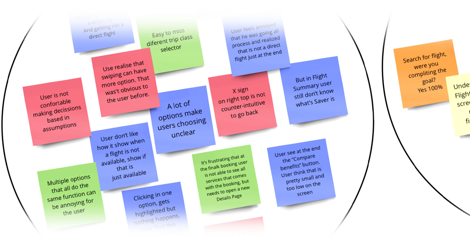
Organizing the data by writing the key findings from the research phase into the stickers and placing them on a virtual board on Miro was an opportunity for me to learn new software. First, I took five colour stickers for each research source to identify where the insight came from – three Usability Tests, one Competitive Benchmarking and one Online Survey. Then, I placed each category with its data creating five groups of different colours.
The next step was identifying the data’s common elements and those related to creating specific groups. Using the grouping technique, I made the following groups: Flight Packages, UX Fails, UX Positivesm Booking Process, Use Desktop, Laptop, phone, travel apps, Home Page, Design, Flying Purpose, Booking Factor, calendar, Booking Decisions and a few more.
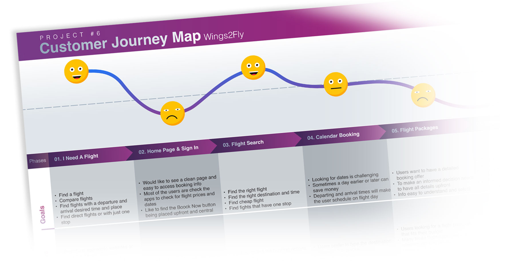
Findings: It was interesting to observe how users from different backgrounds and locations can have the exact needs and values. Users are looking for easy processes, low prices and a thriving online booking experience.
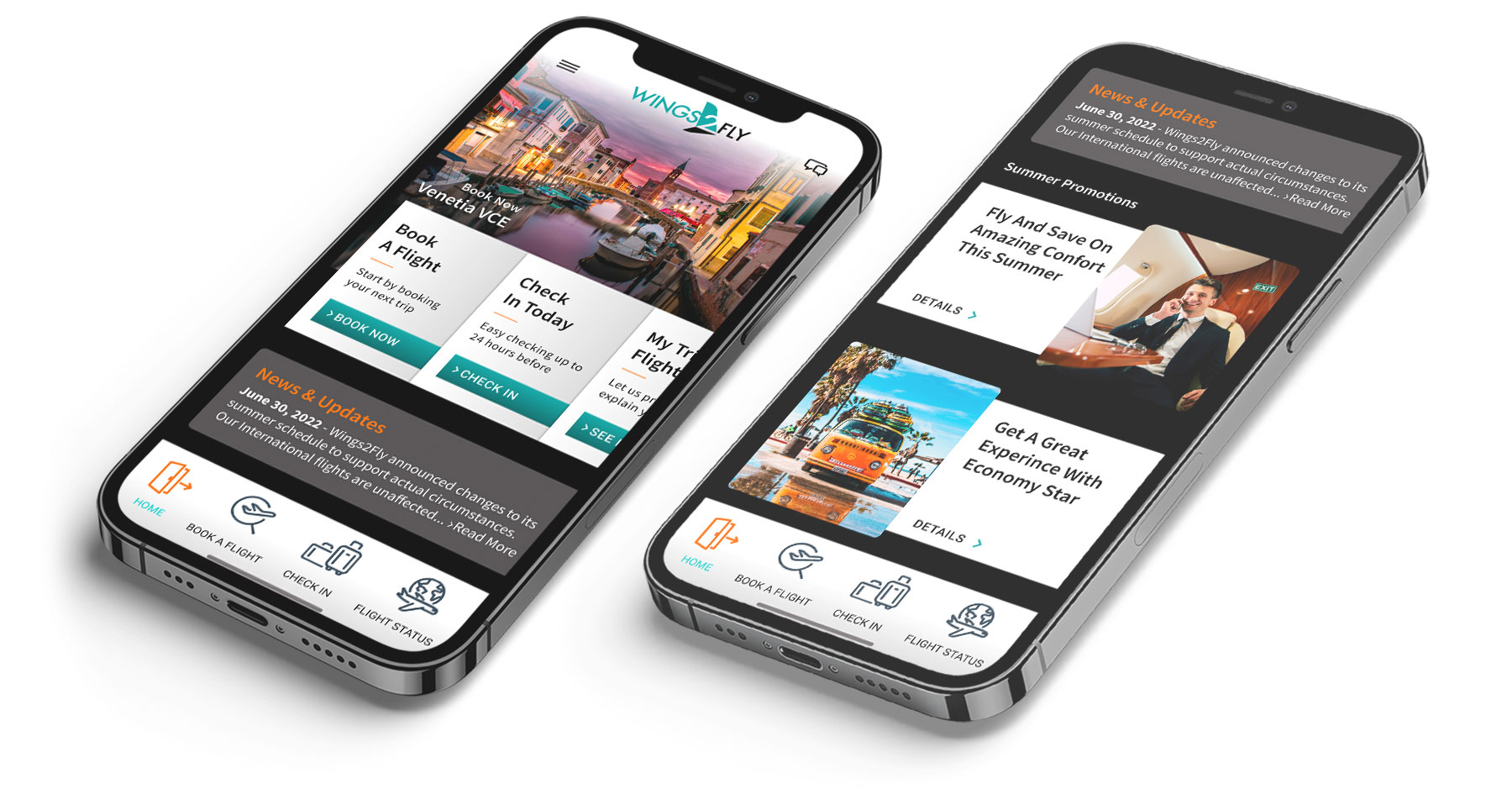
Study: Listening to the user’s voice is the key to improvement, and their feedback is vital and welcomed simultaneously. Booking app software needs to be accessible, understandable and self-explicit. Users like to have the steps explained in plain and unambiguous language and details presented upfront. From a look standpoint, the design should be minimal, pleasing to the eye, and very well explained, judging by the famous saying “less is more.”